


ROLE
TIMELINE
TOOLS
UX/UI Designer
2 MONTHS
Figma, Photoshop, Zoom
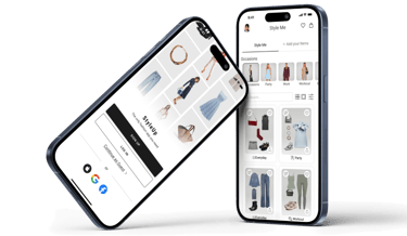
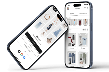
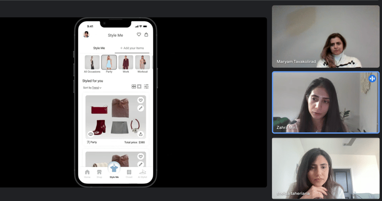
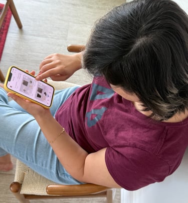
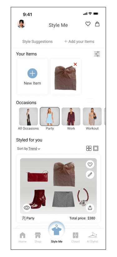
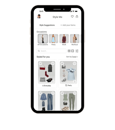
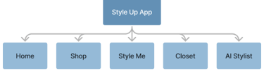
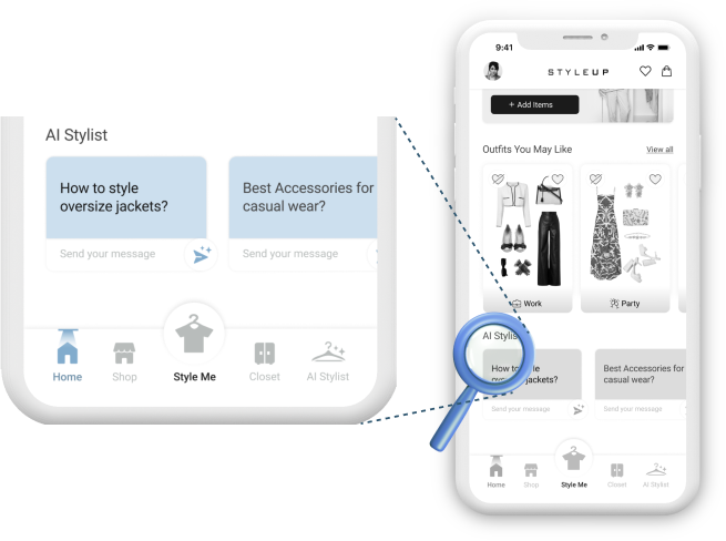
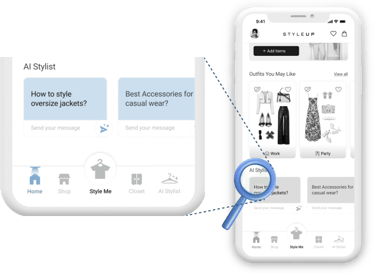
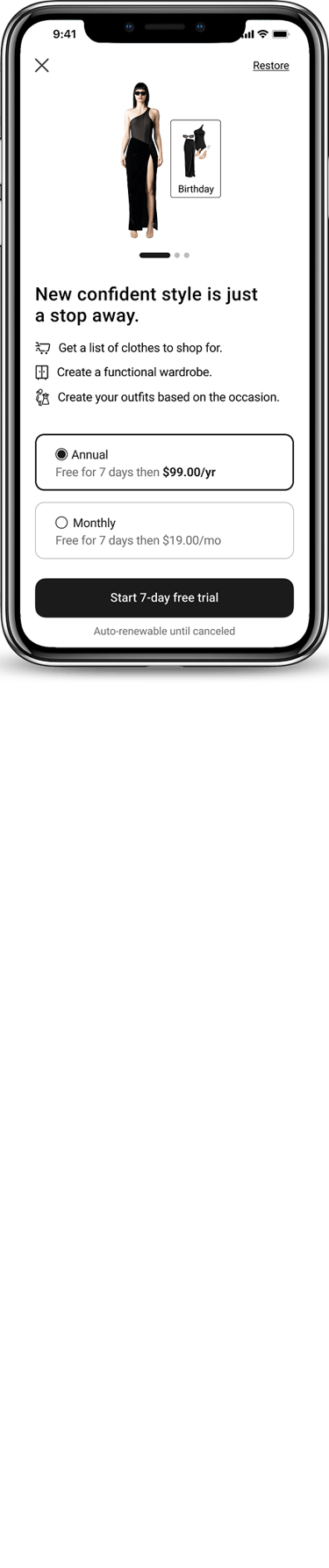
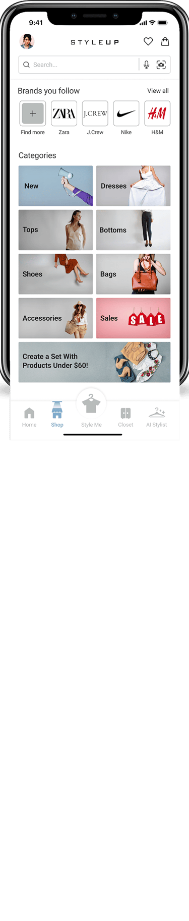
Style UP

Online Fashion Application
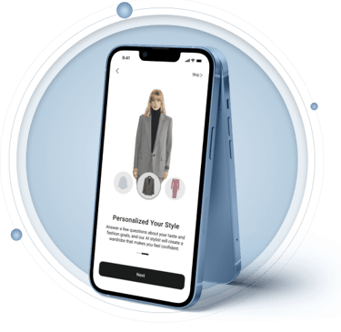
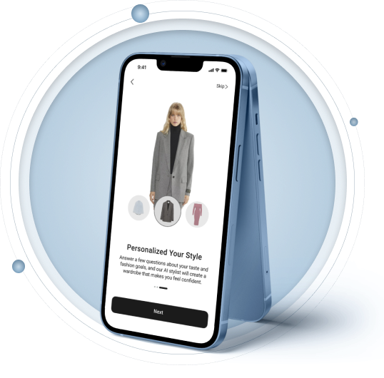
Designing a mobile app, Style Up uses AI to create personalized outfits, match users’ wardrobes, and suggest looks from multiple brands.
An AI stylist that turns " I have nothing to wear " into a 3-tap outfit.
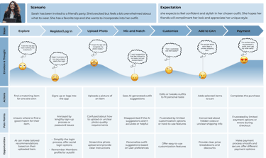
StyleUp helps woman build complete, occasion-ready outfit from clothes they already own, using AI matched to their body shape, fabric preferences, and the moment they are dressing for.
8
5
3
5/7
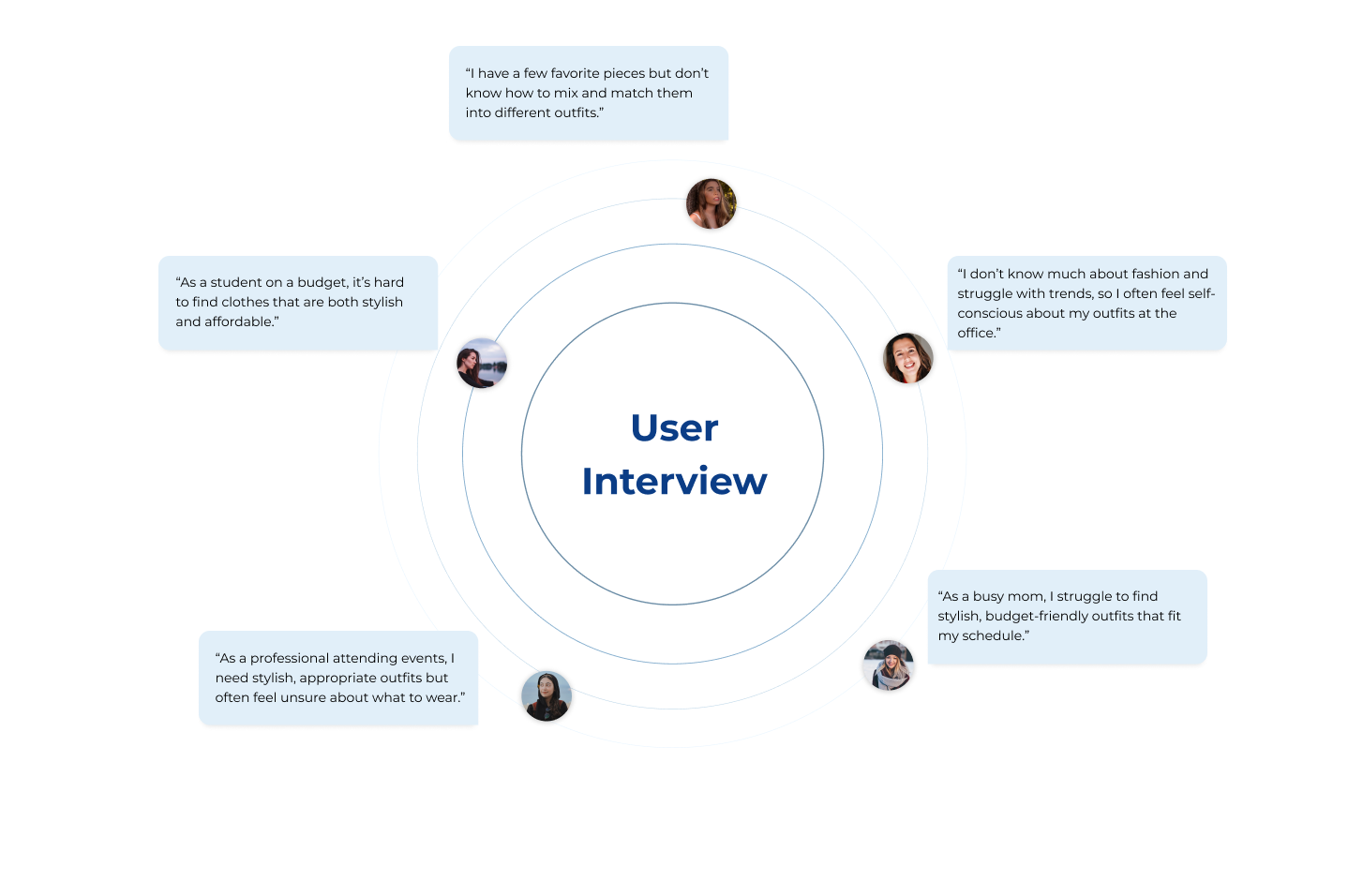
User interviews to define the problem
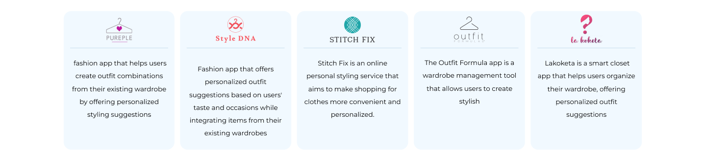
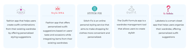
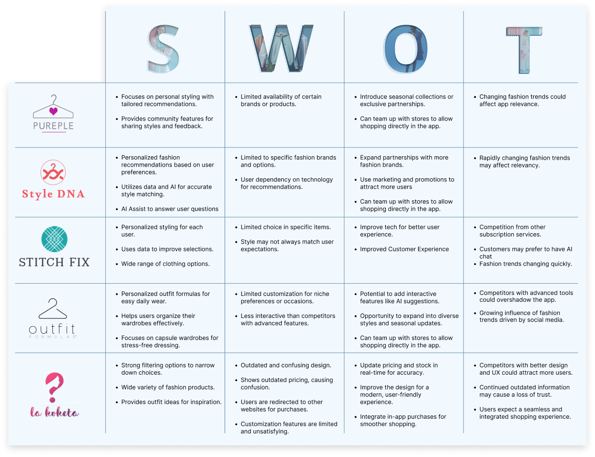
Competitors analyzed via SWOT
Usability rounds-> measurable fixes
Users preferred the final layout (A/B)
Online Fashion Application


THE PROBLEM


7/8
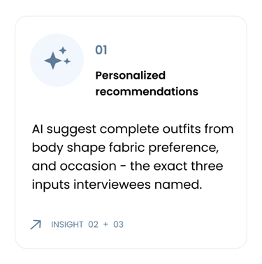
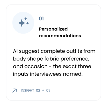
Interviewees said they own clothes they don't know how to style, the core insight that shaped every decision after.
THE PROBLEM . RESEARCH


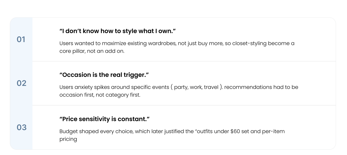
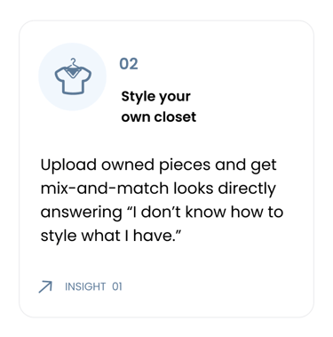
" I have a few favorite pieces but don't know how to mix and match them into different outfit."
- INTERVIEW PARTICIPANT, 26
TOP 3 INSIGHTS THAT DROVE THE DESIGN
THE PROBLEM . RESEARCH


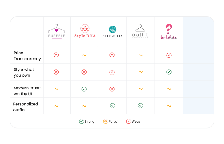
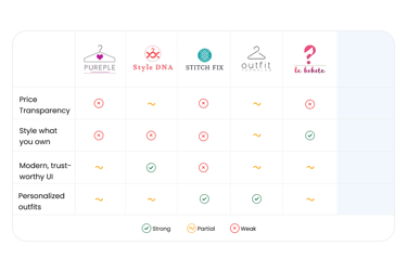
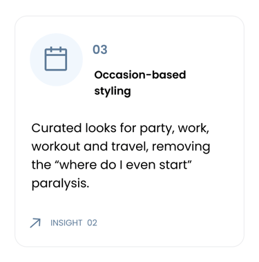
THREE OPPORTUNITIES STYLEUP COUD OWN
Surface prices clearly


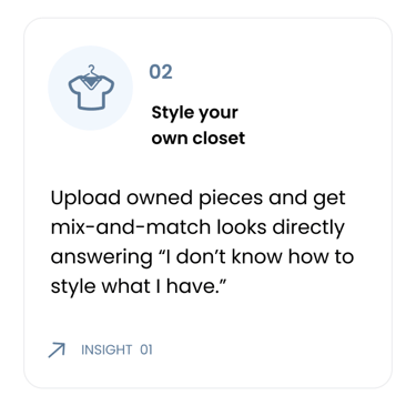
Style what you own
Modern, trustworthy UI
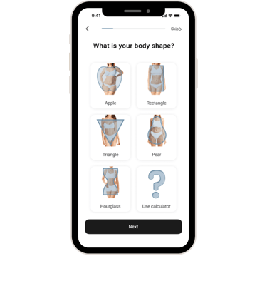
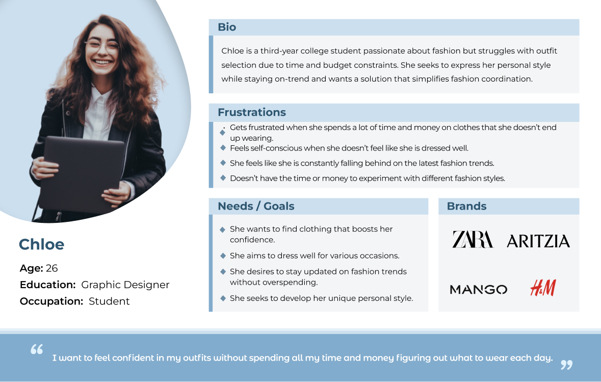
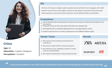
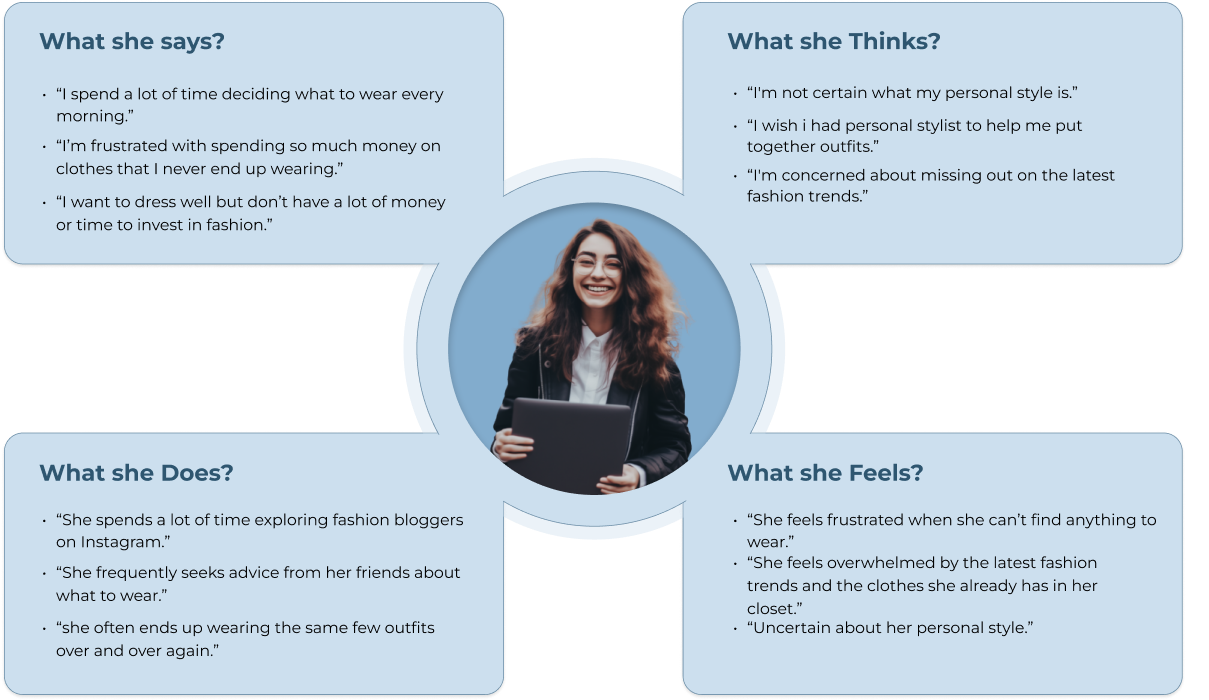
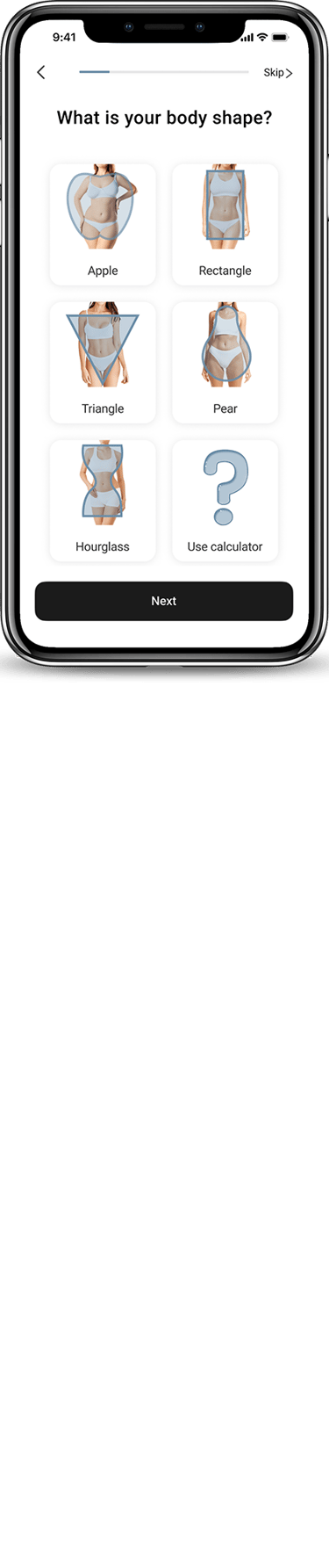
Define . Persona
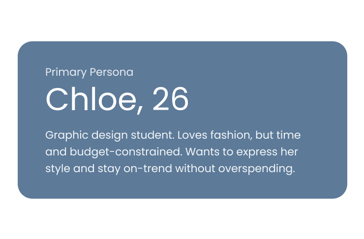
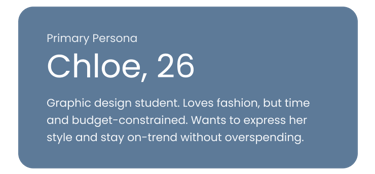
Frustration: Spend time and money on clothes she never ends up wearing, and feels she's always falling behind on trends.
Goal: "I want to feel confident in my outfits without spending all my time and money figuring out what to wear each day."


Define . Persona

KEY DESIGHN DECISIONS


Decision 01


Decision 02
Decision 03


VALIDATE . 3 USABILITY ROUNDS

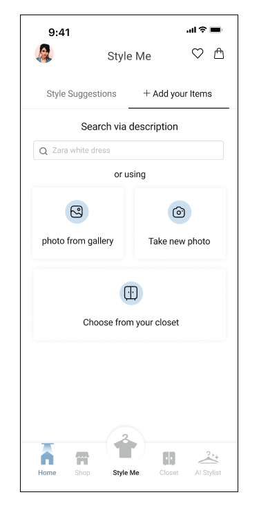
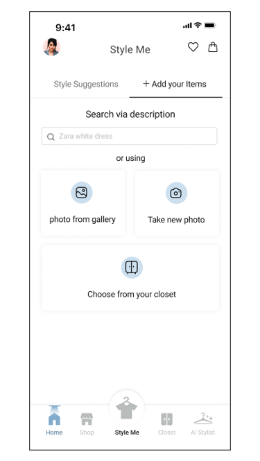
“Add Item Page”
“Add Item Page”
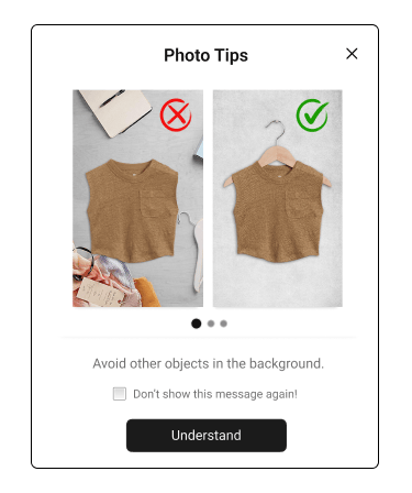
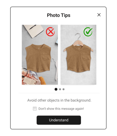
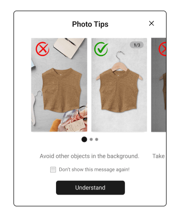
“Photo Tips Page”
Before Usability Testing
After Usability Testing
Before Usability Testing
After Usability Testing
Before Usability Testing
After Usability Testing


Design Process
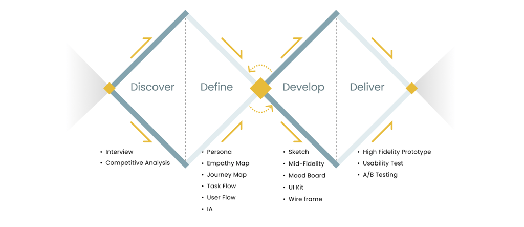
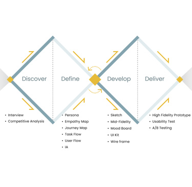
Discover

Define
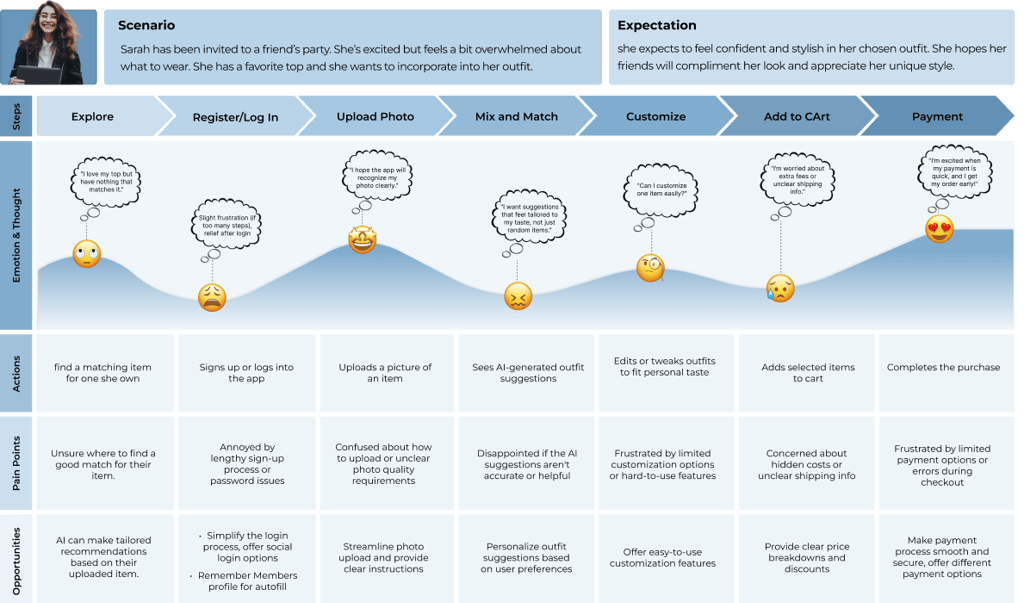
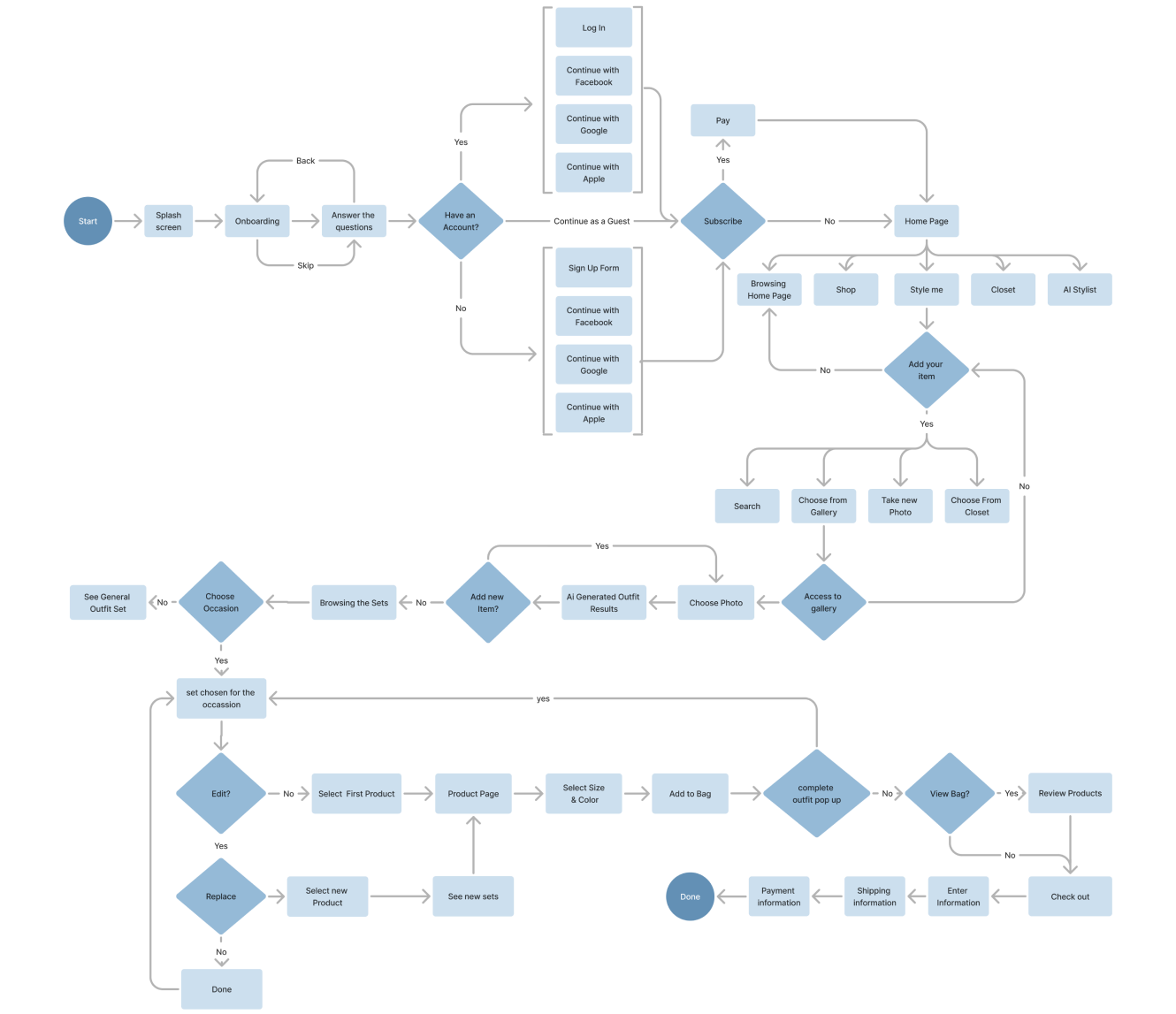

User Flows
Develop
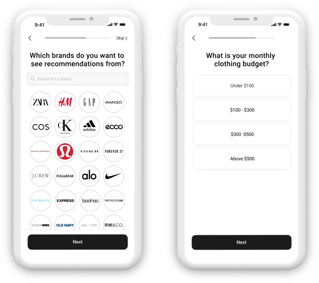
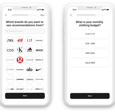


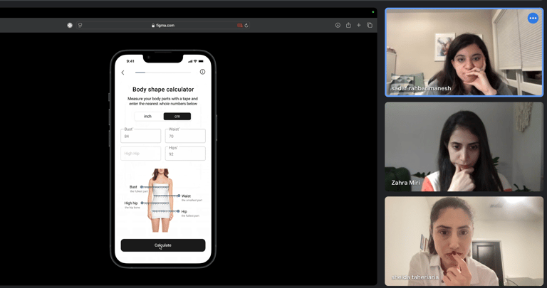
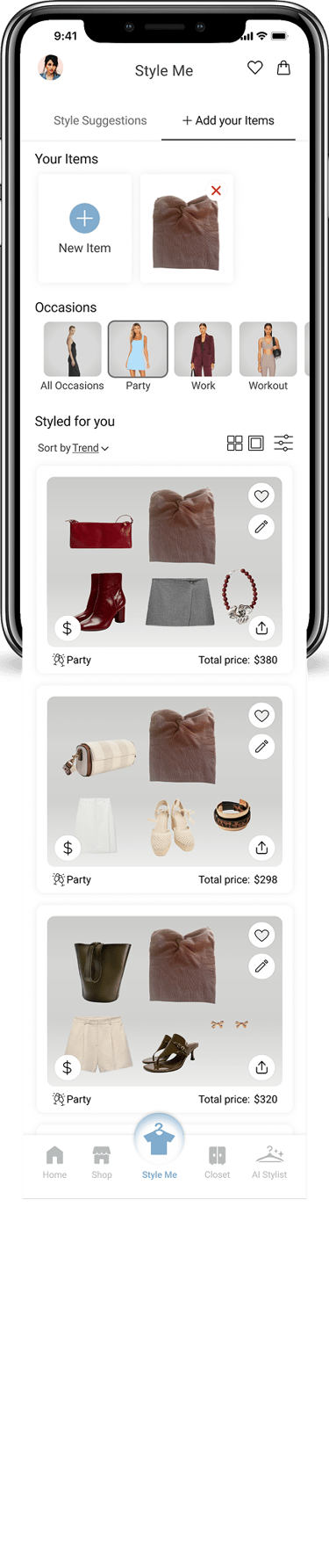
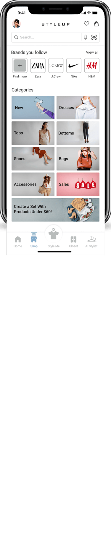
Understanding users' tastes and desired price ranges for outfit sets.
Challenge
1
2
Solution
Asked users about their preferred brands and price ranges.
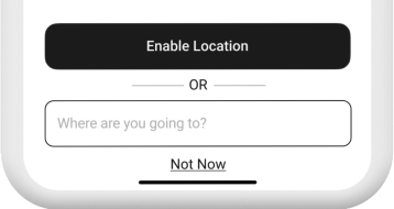
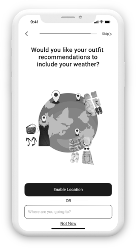
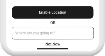
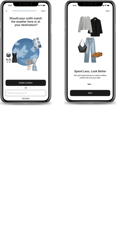
Identifying users’ seasonal outfit needs for travel based on their destination.
Ask users for their travel destination to tailor outfit recommendations and add visuals to showcase items better.
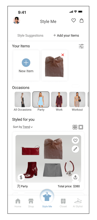
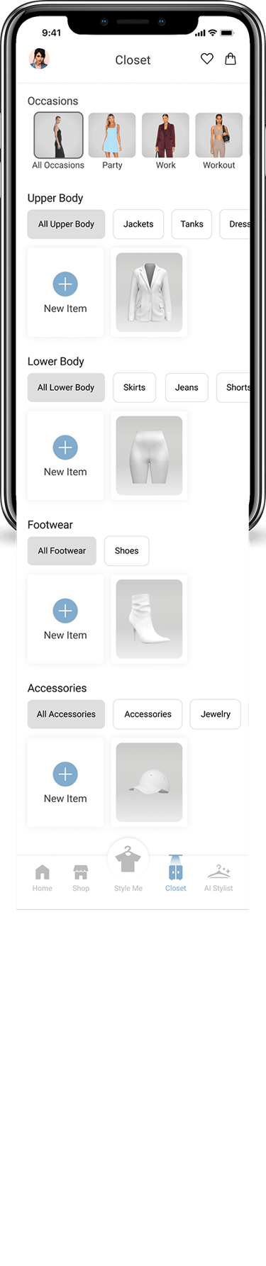
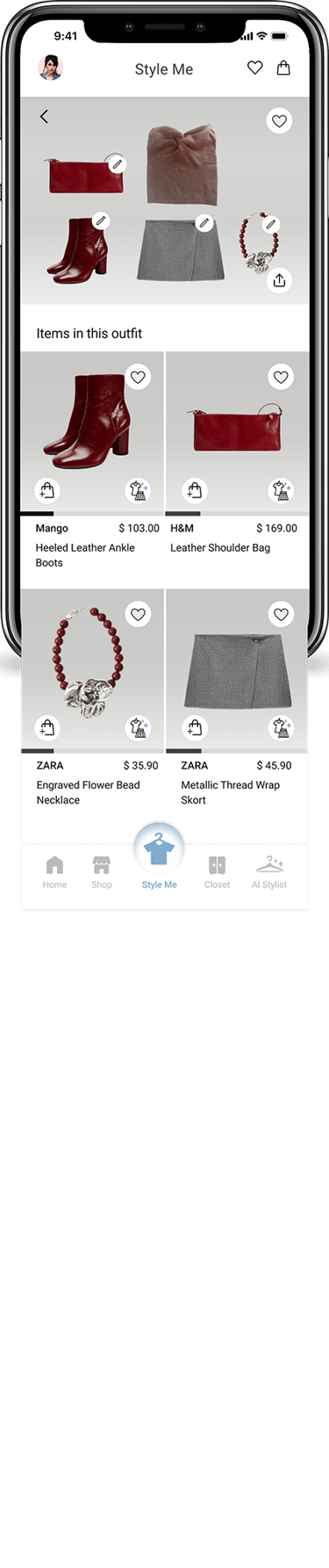
Users prioritize affordable options in their shopping choices, so we needed to address their price sensitivity.
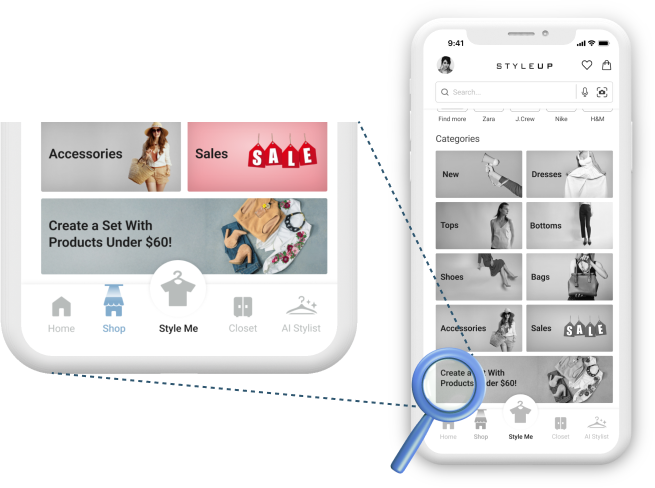
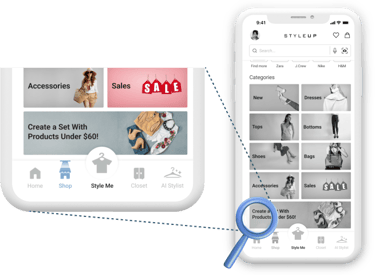
We created a section for outfit sets under $60.
We displayed set prices directly under each recommendation and added a filter option to sort sets by total price.
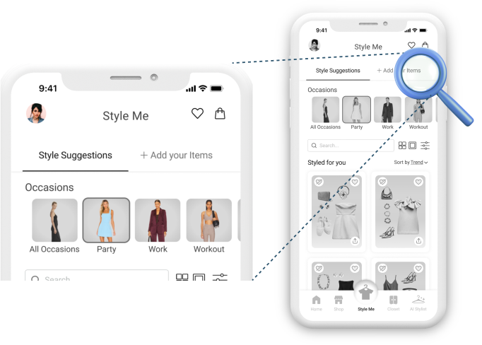
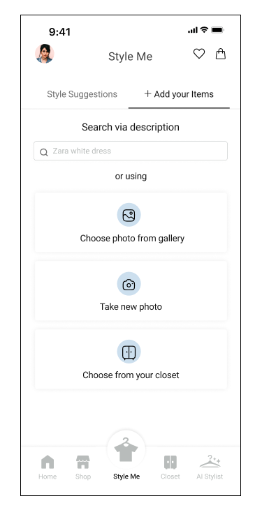
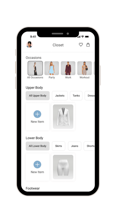
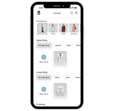
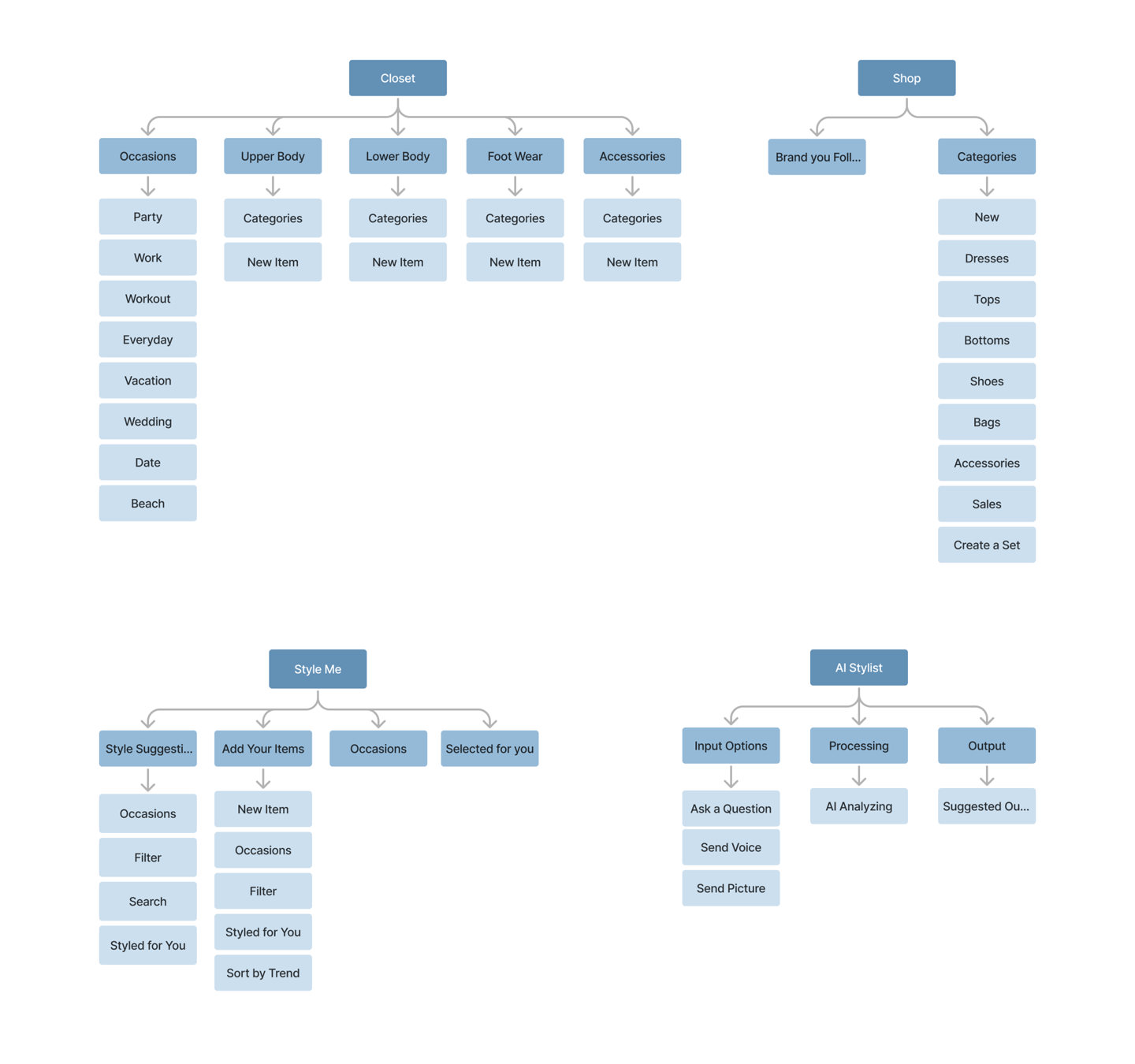
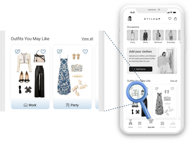
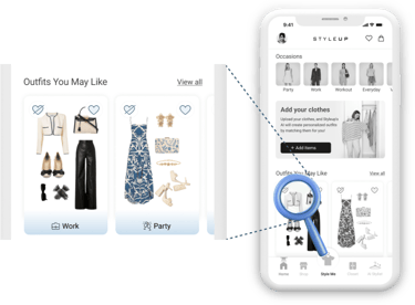
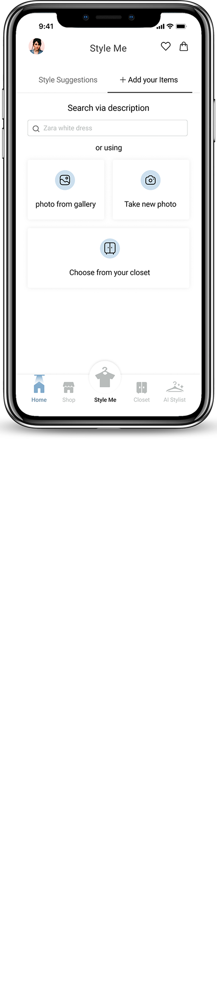
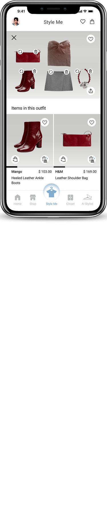
Our main challenge was to avoid confusing users while creating an easy navigation process for viewing outfit sets and adding items.
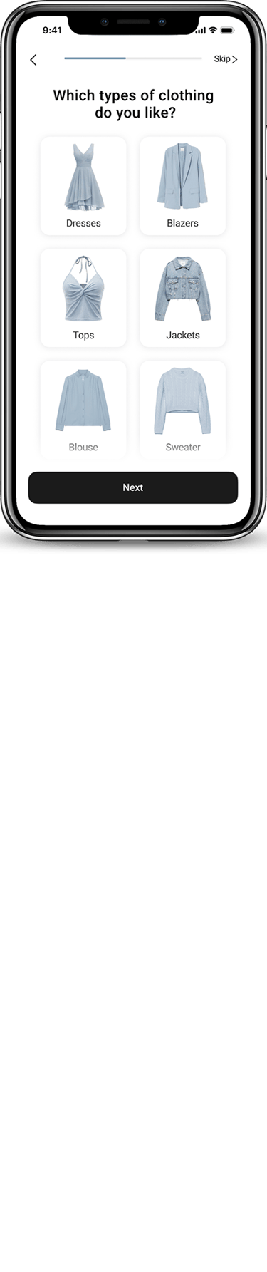
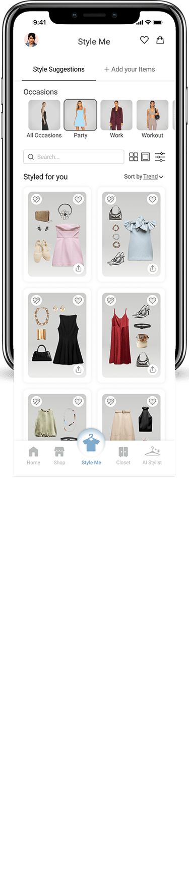
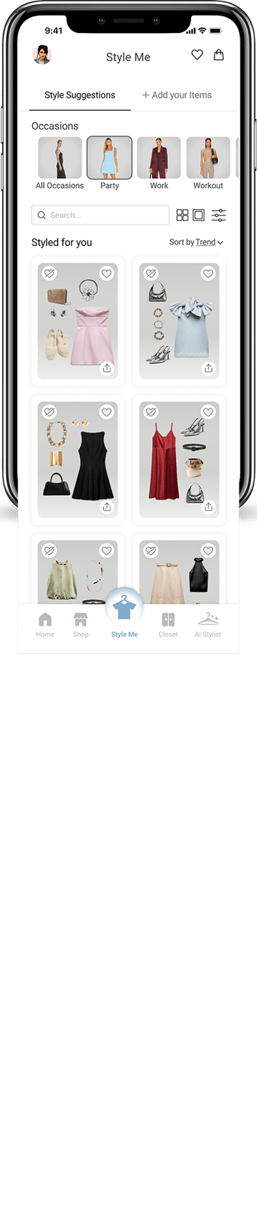
Created two sections:
One for users to add an existing item to see outfit sets.
One for users to receive outfit sets based on their responses to questions.
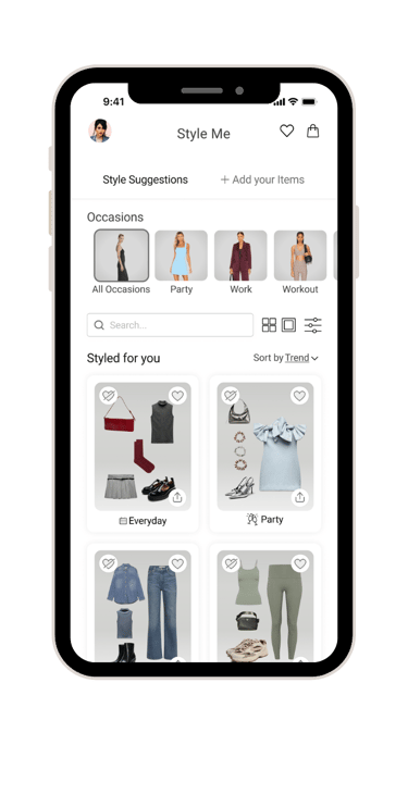
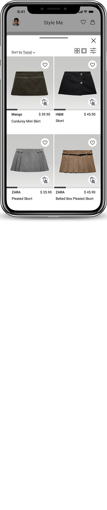
Understanding user taste deeply.
Implemented "like" and "dislike" options for feedback on outfit sets. Displayed all outfit sets on the homepage for easy access and quick visibility.
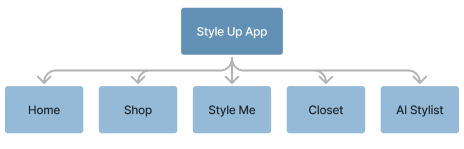
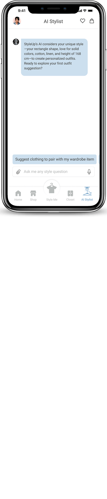
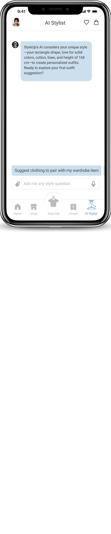
Ensuring users quickly understand the AI stylist feature at a glance.
Added a send icon and a brief message to indicate the start of a conversation with the AI stylist.
3
4
5
6


Develop
Challenge
Solution
Challenge
Solution
Challenge
Solution
Challenge
Solution
Challenge
Solution
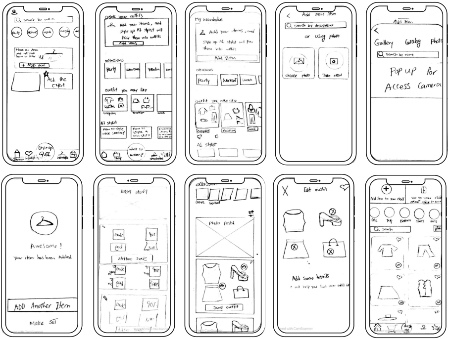
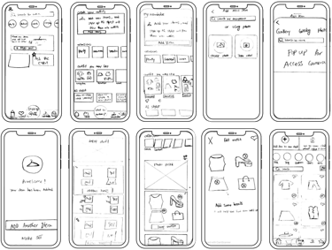
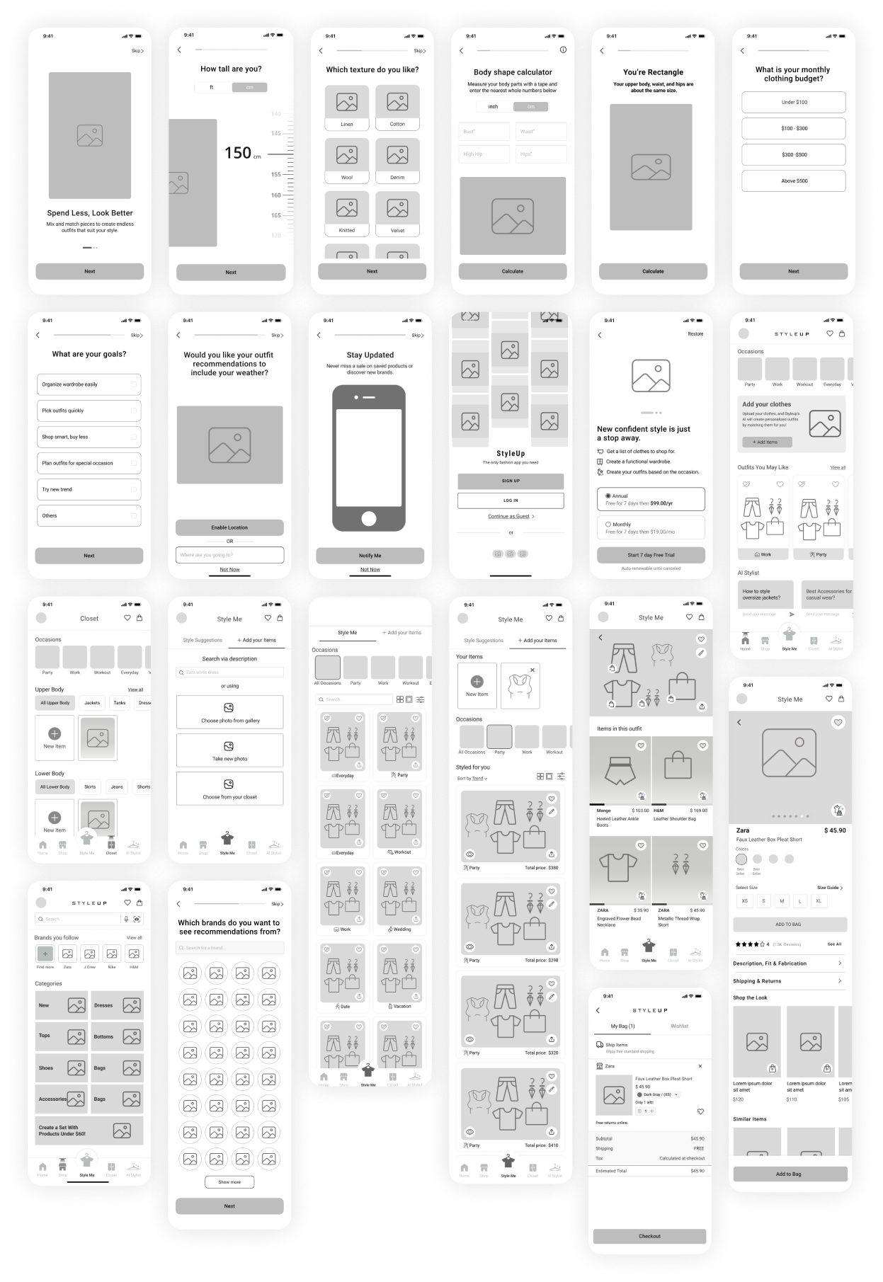
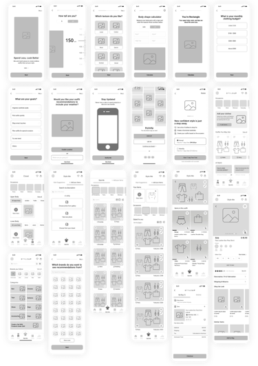
Lo-Fi Wireframes
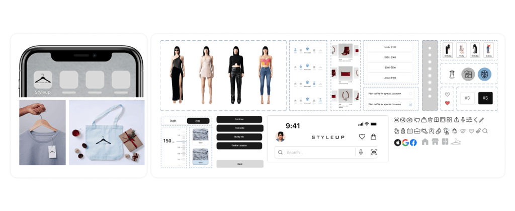
Logo and Components
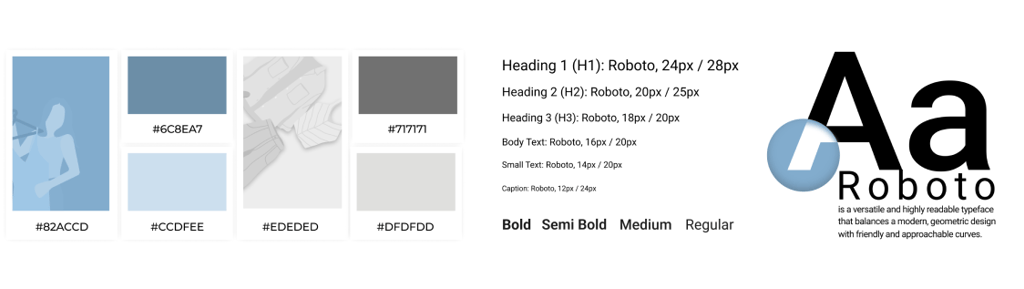
Color Palette
Deliver
Frame B won, 5 of 7 users.
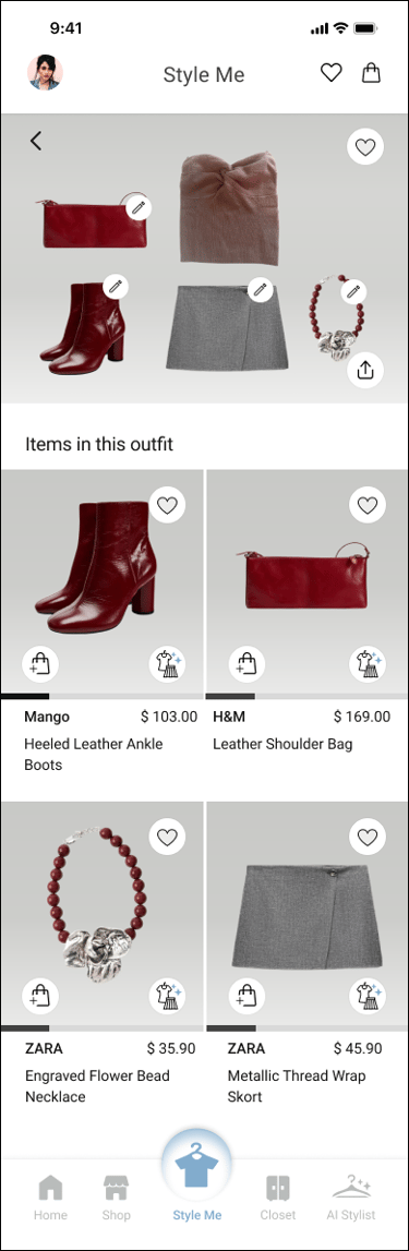

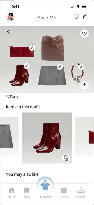


“Product Page”
A/B TESTING
I tested two layouts for viewing items within an outfit set. Users preferred Frame B — it let them scan individual pieces without excessive scrolling and felt more user-friendly overall.
Frame B won, 5 of 7 users.
“Product Page”
A/B Testing
I tested two layouts for viewing items within an outfit set. Users preferred Frame B — it let them scan individual pieces without excessive scrolling and felt more user-friendly overall.


Deliver
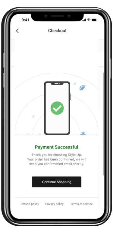
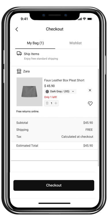
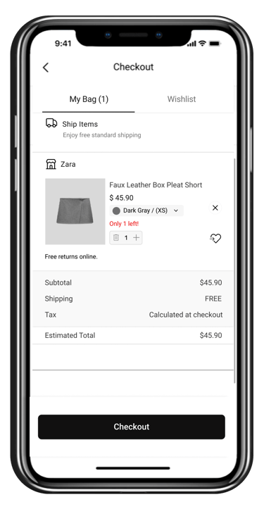
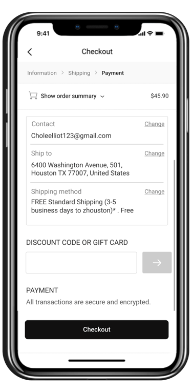
A end-to-end experience refined through continuous user feedback
OUTCOME


3
usability rounds turned confusion points into confirmed fixes


100%
of round-3 users located item prices after the $-icon change
5/7
preferred the final product-page layout in A/B testing
REFLECTION
What I'd carry into the next project.
What I learned
Research judgment matters more than method.
Pivoting to non-users when I couldn't reach app users taught me
to adapt the plan to reality.
Every decision needs a "because".
Tying each feature to an insight made the design defensible — and easier to test.
Small UI cues carry big weight.
An icon swap (eye → $) was the difference between confusion and instant understanding.
What's next
Measure live impact.
Ship and track adoption, set-completion, and conversion against the assumptions here.
Deepen the AI loop.
Use like/dislike feedback to make recommendations sharper over time.