

ROLE
TIMELINE
TOOLS
UX Researcher/UI Designer
2 MONTHS
Figma, Figjam, Photoshop, Google Form
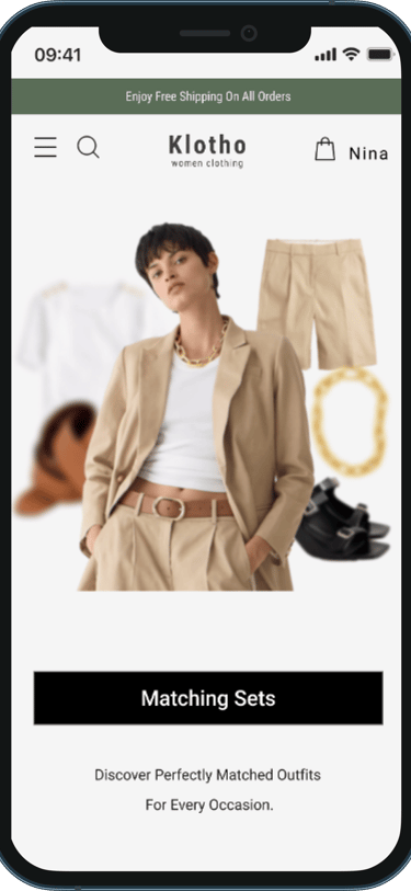
Klotho


Online Fashion Responsive Website
Designed a fully responsive e-commerce website for a women’s clothing brand, focused on seamless shopping and mobile usability.
Klotho is an online shop for women that provides versatile, stylish clothing that bridges the gap between formal and casual wear. Drawing inspiration from leading fashion brands, our user friendly platform makes it easy for women to discover and purchase outfits for various occasions at affordable prices.
Overview
Struggling to Find Versatile, Stylish Outfits for Every Occasion
Women often struggle to find clothing that strikes the right balance between formal and casual for various occasions. Many existing options are either too formal or too casual, making it difficult for women to find versatile outfits that suit different events without compromising style. Additionally, coordinating outfits can be time-consuming and overwhelming, especially for those with busy lifestyles.
WHAT IS THE PROBLEM?
What We Were Trying To Achieve
Create a bold, modern, and empowering visual identity that delivers a seamless user experience.
Design a website with user friendly interface for our users
Enhance the shopping experience by adding a mix-and-match feature that helps users quickly coordinate stylish outfits with less time and effort.
Develop an intuitive occasion-based shopping experience that enables users to effortlessly find the right outfits for any event.
Who Are The Users?

Women with busy lives who need versatile, stylish clothing that seamlessly transitions between semi-formal and casual occasions.
We Concentrated on designing a website for both targets

Women who struggle with outfit coordination for specific events and seek a convenient shopping experience with curated, occasion-based outfits that aren’t overly formal.
Design Process
WHAT IS THE PROBLEM?
Competitive Research Insight
We analyzed four similar websites and began the design process with a thorough competitive analysis. This approach provided insights into essential features and current design trends, helping us understand crucial functionalities and identify gaps or opportunities for innovation.
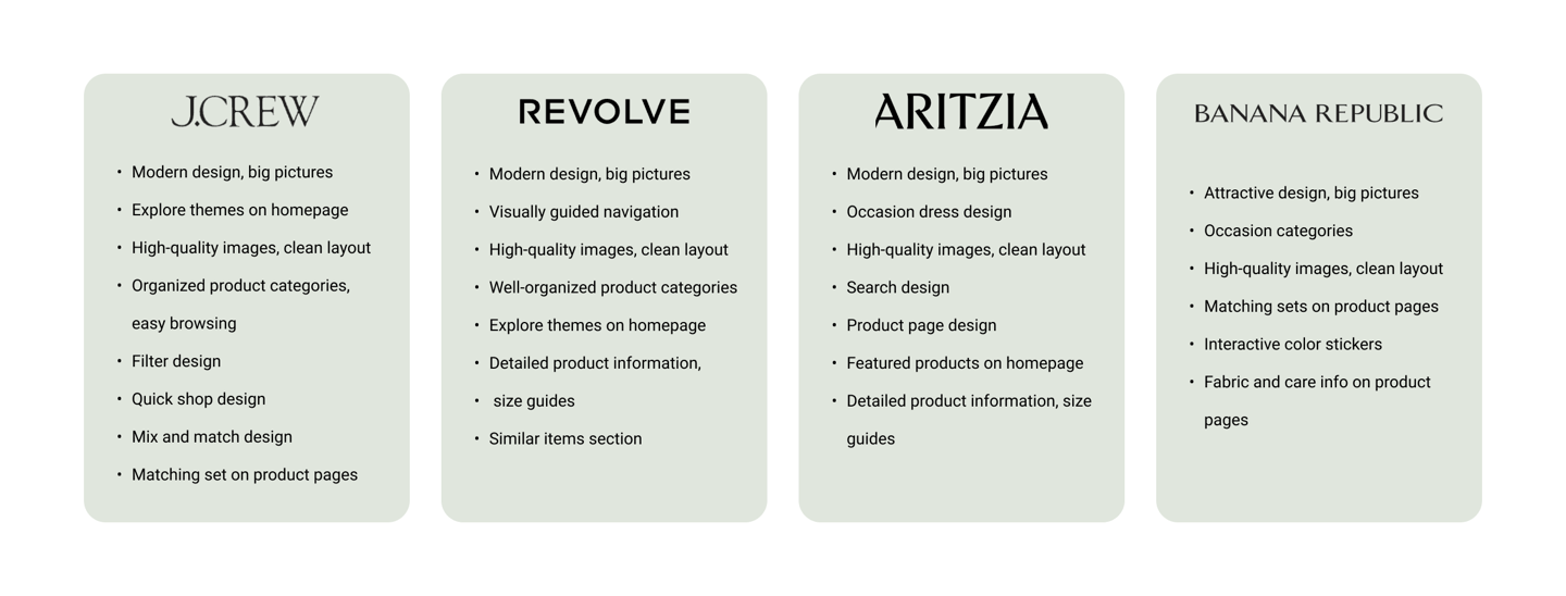
Above, we outlined the key aspects that influenced our design process.
Examining competitors’ navigation helps us ensure that information is easily accessible for users.
Reviewing competitors' features allows us to integrate valuable functionalities into our website.
Analyzing competitors' UX/UI reveals current design trends and best practices for creating a modern and visually appealing website.
Top Key Takeaways
Then the survey gave us the following insights:
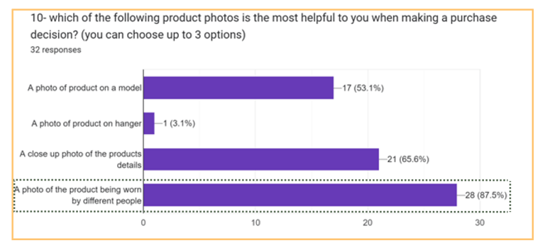
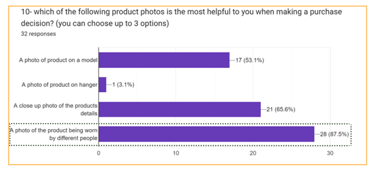
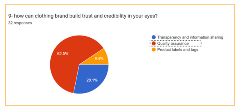
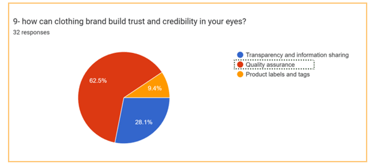
We conducted an online survey with 11 questions and 32 participants to gather insights on users' concerns and needs. our goal was to understand the essential factors for users when buying clothes online and identify any barriers that might prevent them from doing so. below are the main challenges highlighted by users regarding online shopping.
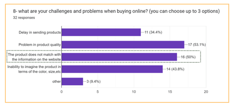
1- User found it challenging to lack of information about the product on the clothing websites.
2- Users found it challenging to asses the quality of products related items on the website.
3- Users find the feature of viewing clothing on peoples body is helpful.
Our participants provided valuable insights that underscored the importance of reviews and quality photos in showcasing clothing. In particular, users were looking for suitable categories and filters for easier online shopping. Also, a large percentage of users preferred to shop in person due to ordering the wrong size of clothes in online shopping.
Using the Jobs-to-be-Done framework, we uncovered UX designers' main needs in portfolio creation
60%
It was interesting to find that users have very different approaches and challenges when shopping for clothes online:
40%
50%
Understanding users core needs
Conducted user interviews to gain a deep understanding of users' problems
I developed a script and conducted interviews with 8 people who either shop for
clothes online or have stopped doing so, aiming to understand their challenges
during the purchasing process.
Prefer to create their own styles.
Lack confidence in online color coordination, often sticking to the same colors.
Struggle to complete purchases, especially when browsing many pages or buying matching sets.
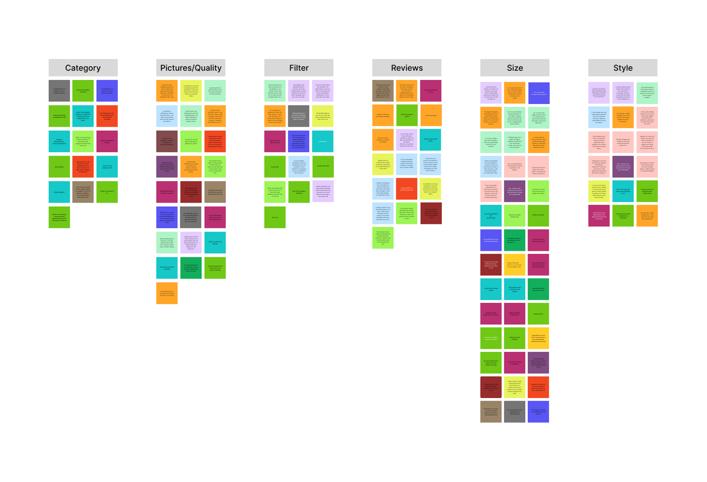
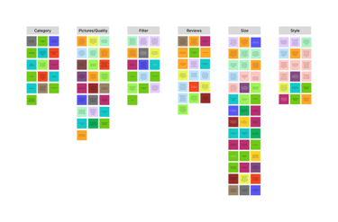
Affinity Mapping
Grouping users insights to find problem statement
The main issues I identified were complicated websites, unclear categories, misleading images, and difficulty ensuring the right fit and quality, with customer reviews being the most helpful feature for decision making.
"Some websites are very difficult to work with, complicated words to describe clothes and inappropriate categories are really awful"
"A big frustration was ordering from a site with misleading images. The clothes looked great online but were poor quality in person."
"The feature that helps me the most in deciding to make the purchase is customer reviews. "
"The biggest challenge is ensuring the right fit and quality. Without trying them on or seeing them in person, it's hard to know if they'll be comfortable or look good. "


INSIGHTS FROM RESEARCH
What's Frustrating users The Most
🚫 Complicated Navigation
📝 Confusing Descriptions
🖼️ Misleading Images
👗 Fit Uncertainty
❌ Poor Quality


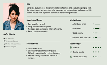
Defining Persona & Goals
Based on our research findings, we built one primary persona to build empathy and keeping the user at the center of the design process
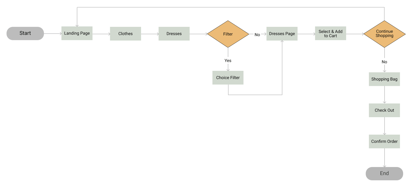
Designing the information architecture
User Flow

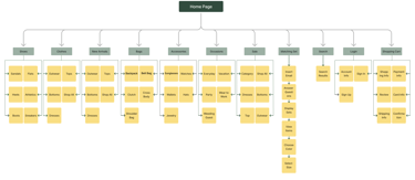
SITE MAP

From Insight To Ideation
Develop
Challenges
Solutions
1
visual aids by Pictures
4
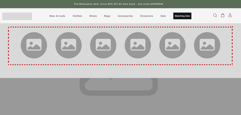
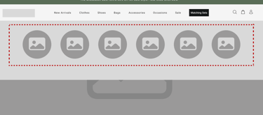
Implemented a navigation bar with featuring pictures for each item to help users easily identify and select products.
2
Enhance User Engagement
Increasing Purchase Decisions
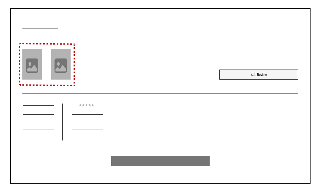
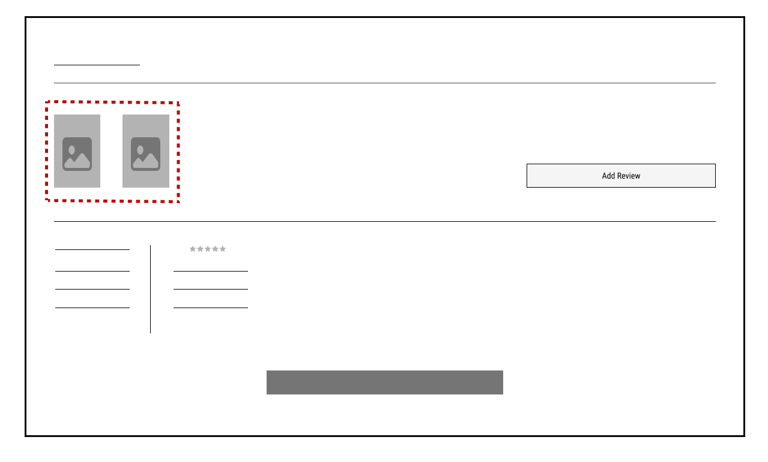
Added a section for reviews with customer photos, offering better visual context for informed purchasing decisions.
Designed a product display that includes clickable color options showing real photos from various angles and a zoomed-in fabric view, offering a detailed perspective on the product for detailed fabric inspection.
Enhance User Experience Through Visual Quality
3
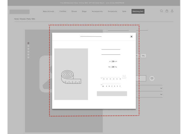
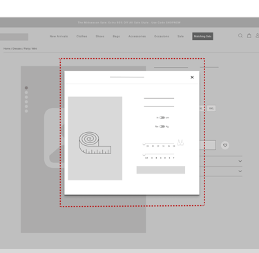
Ensuring the Right Fit Without In-Person Try-On
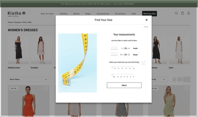
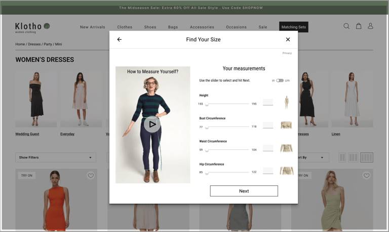
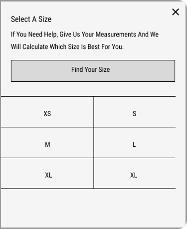
Implemented a Fit Assist feature that asks users a few questions and provides instructions on how to measure their size accurately. This feature then recommends the correct size based on their measurements, helping ensure a better fit and reducing the uncertainty of online shopping.
5
Enhance User Trust for clothes quality
Creating a navigation bar that allows users to quickly find products by category for a seamless shopping experience.
Implemented a sticky navigation bar that stays visible as users scroll, making it easy for them to quickly locate and select items like "Sale."
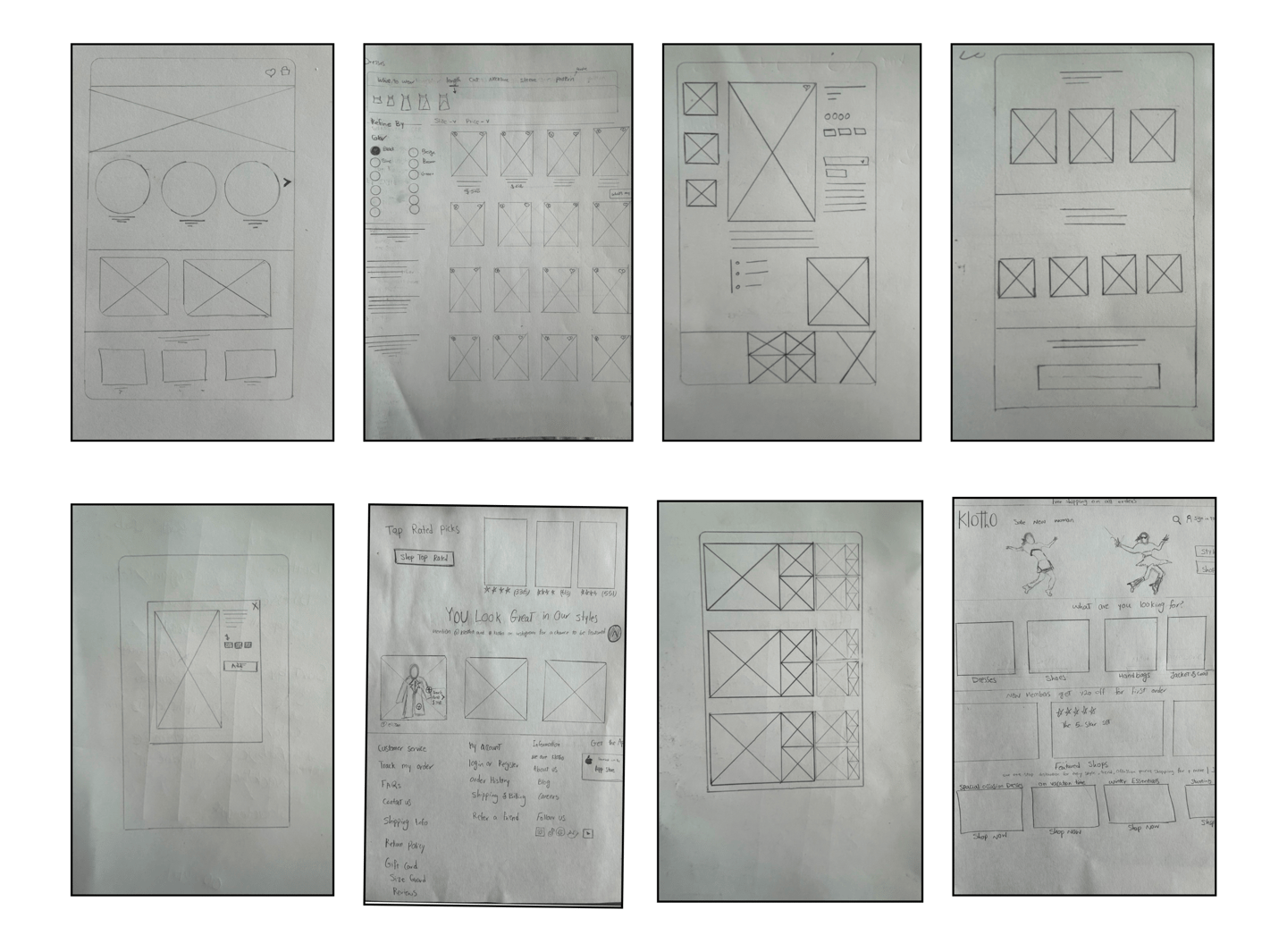
We sketched some ideas and designed low-fidelity wireframes that would allow us test and get feedback quickly.
Sketches
Early Design

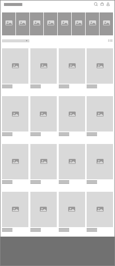
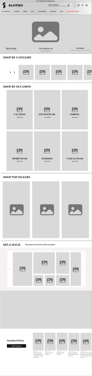
Home Page
Dresses Page
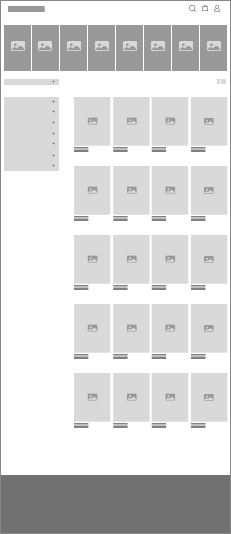
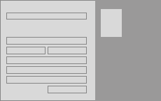

Menu
Product Page
wireframing
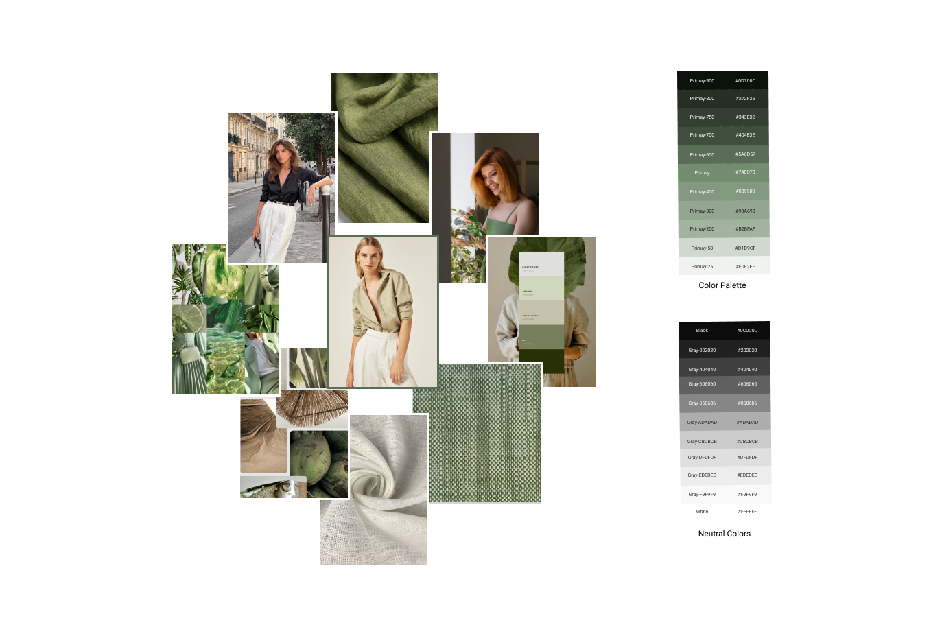
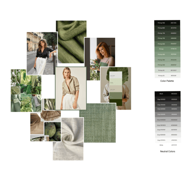
Here are the planned brand attribute
Natural
Elegant
Modern
Mood Board
Bringing It To Life
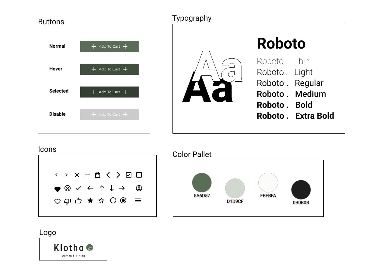
UI KIT
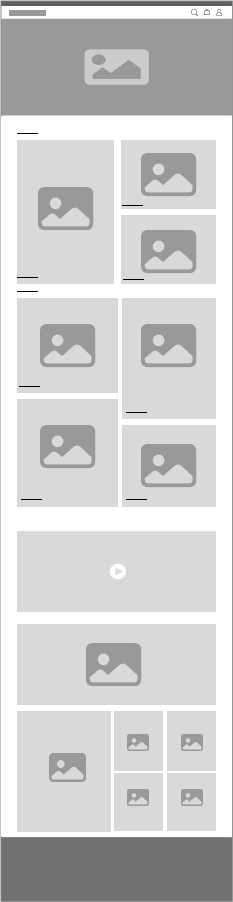
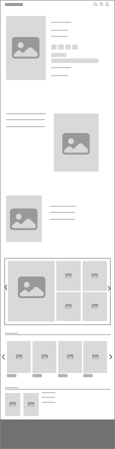
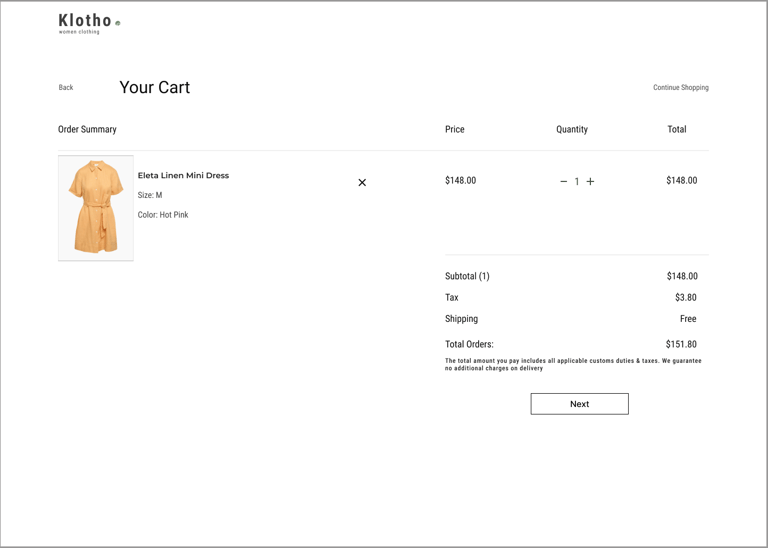
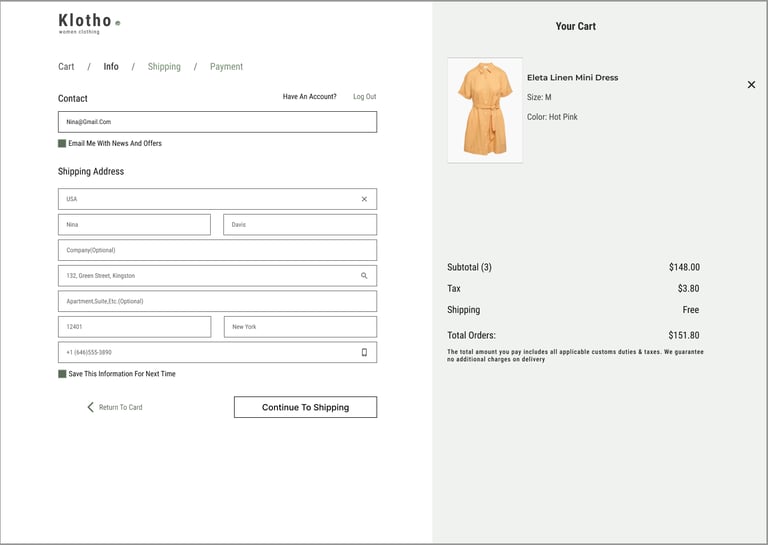
High Fidelity Wireframe
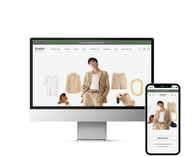
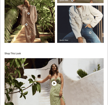
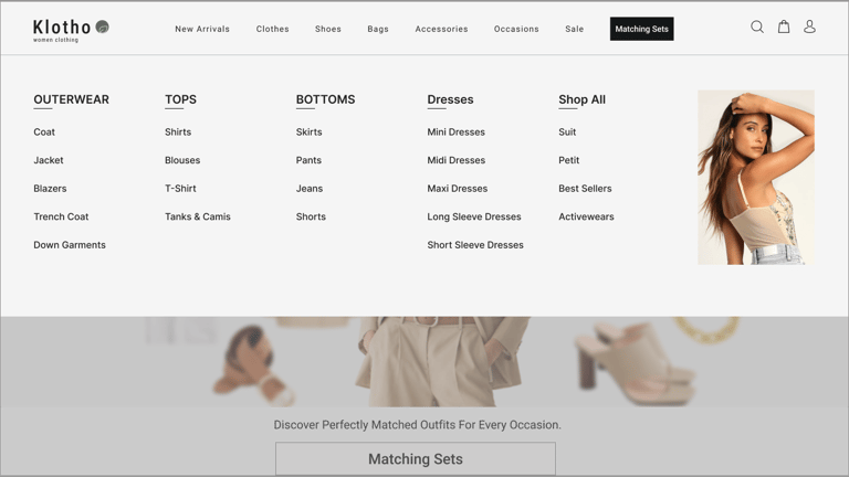
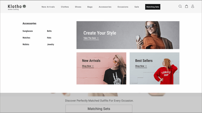
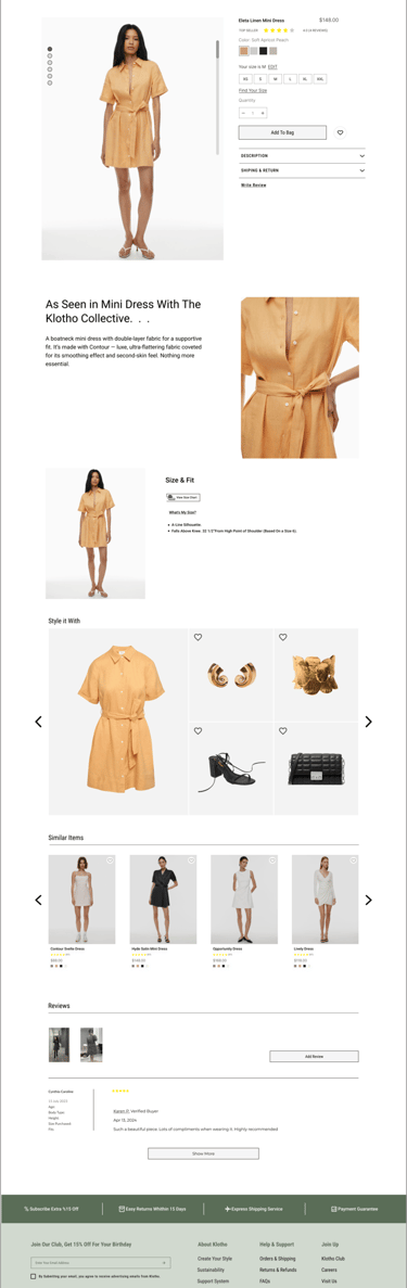
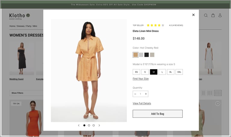
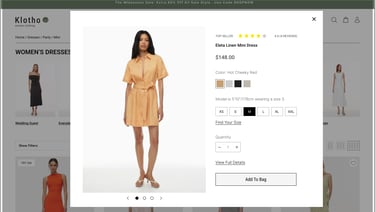
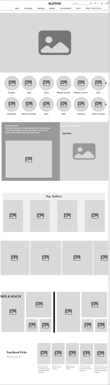
Here are the final high-fidelity desktop and mobile designs that we've designed after going through multiple iterations on different pages.
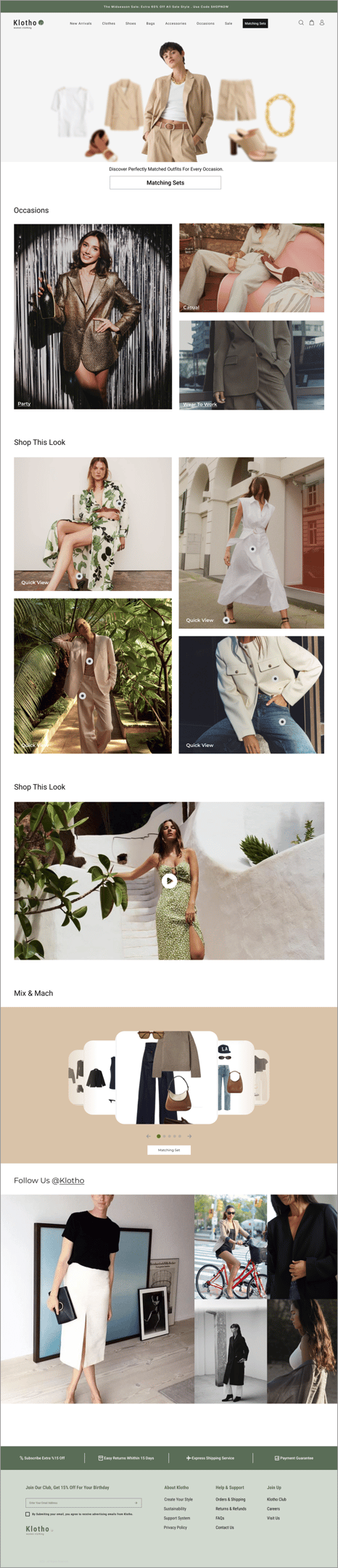
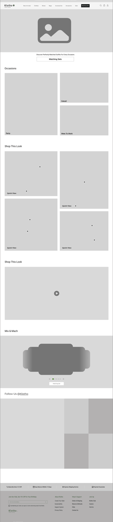
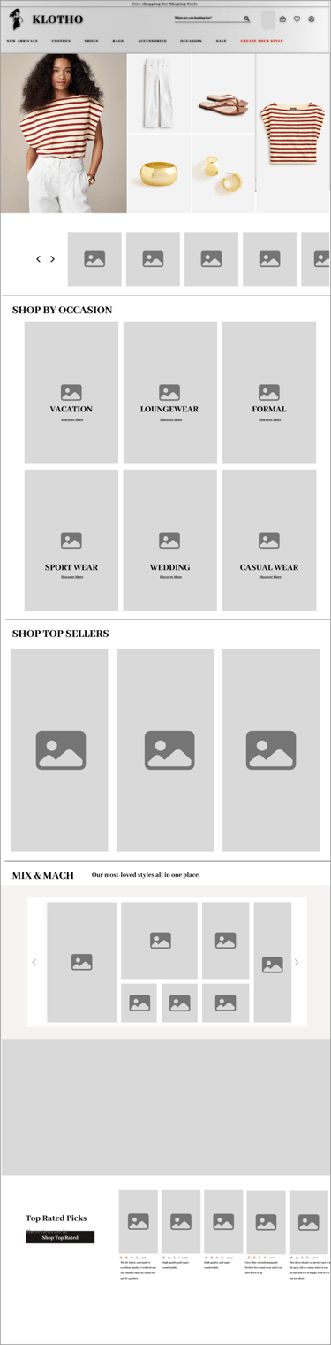
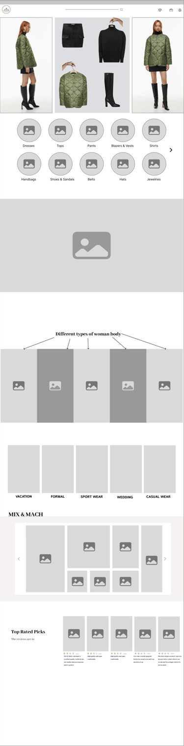
Home Page
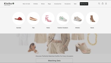
Menu
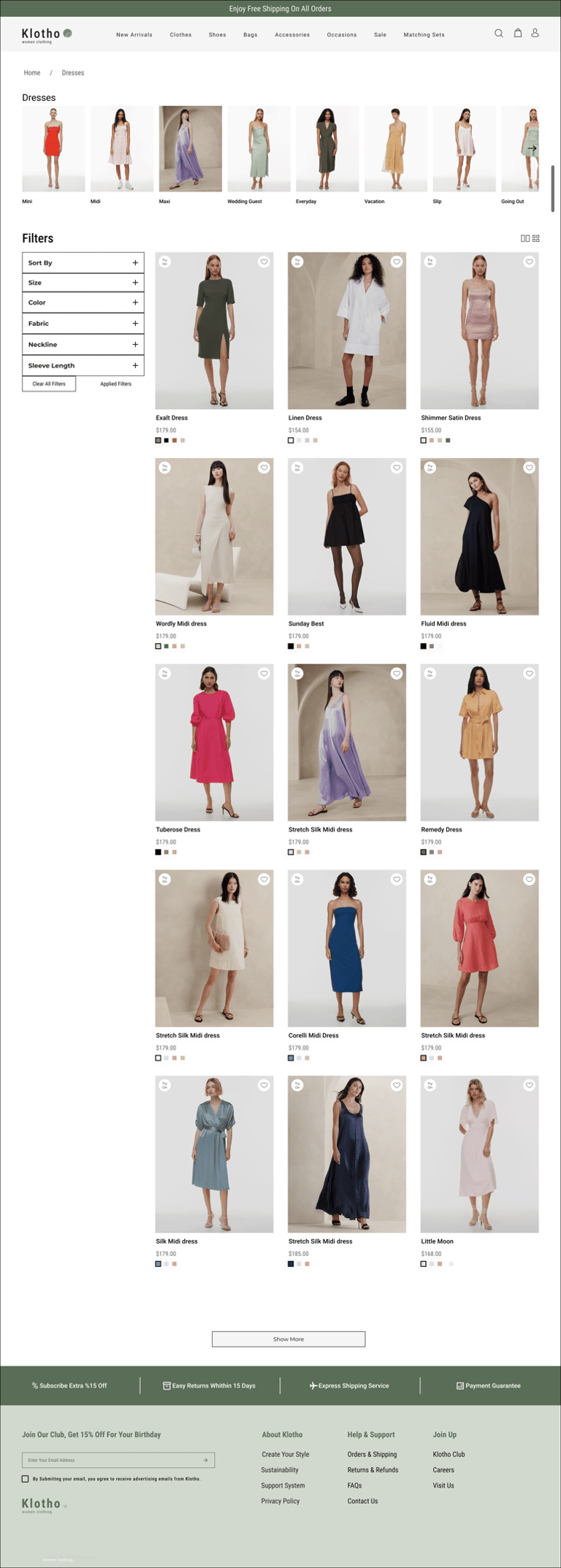
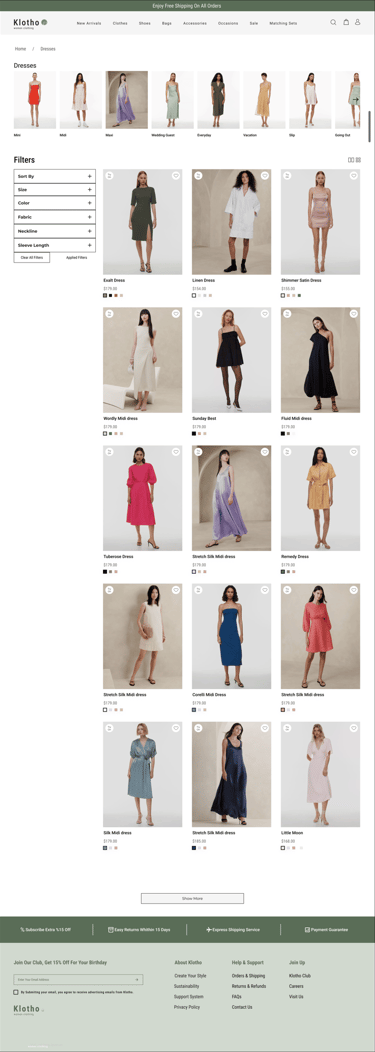

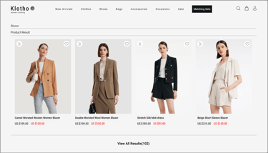

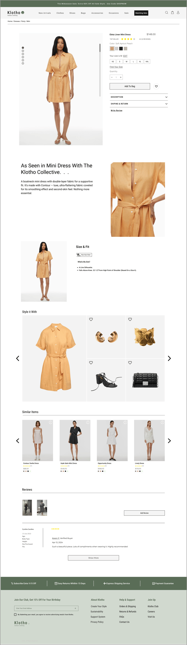
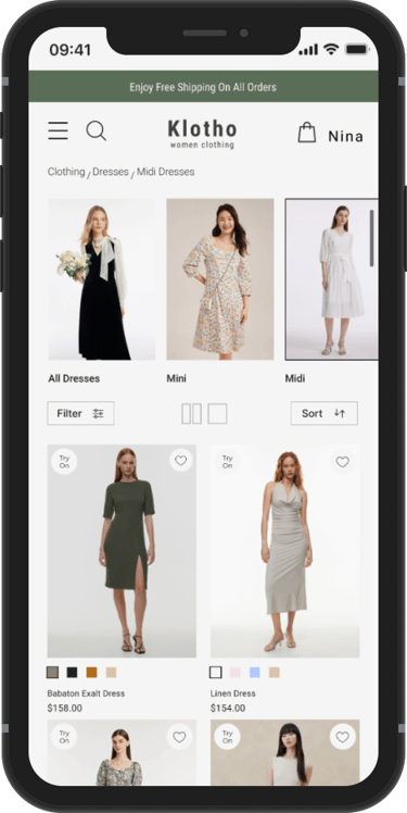
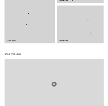
Dresses Page
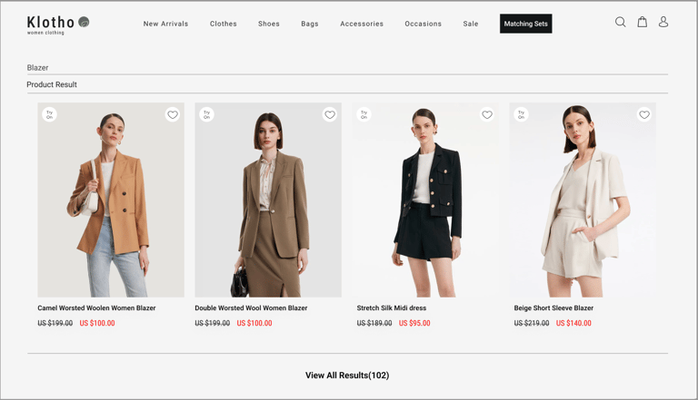
Product Page
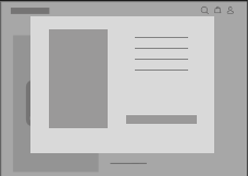
Quick View
Find Your Size
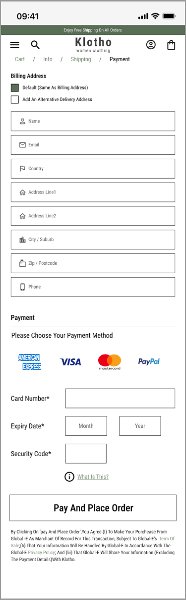
Checkout

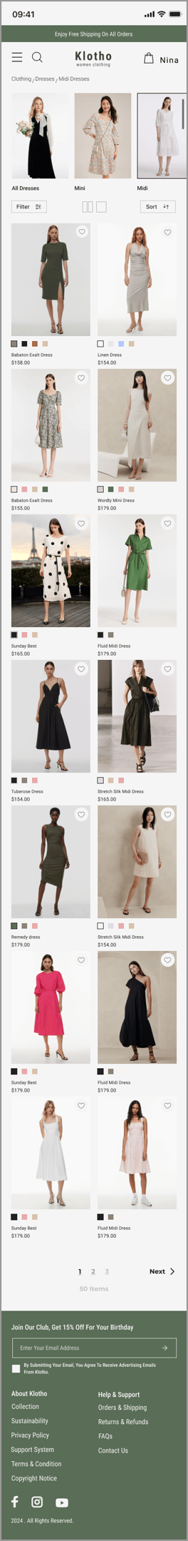


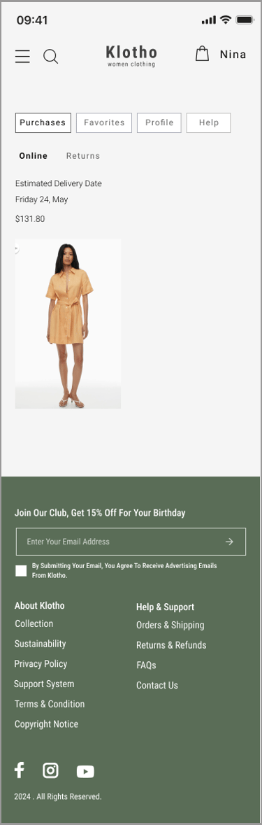


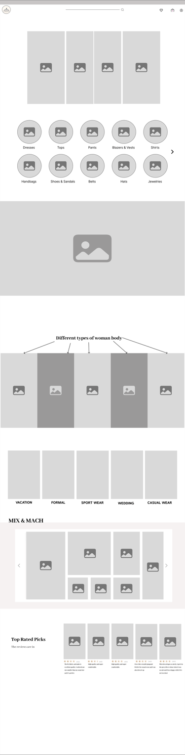
We have designed over 30 Mobile pages.
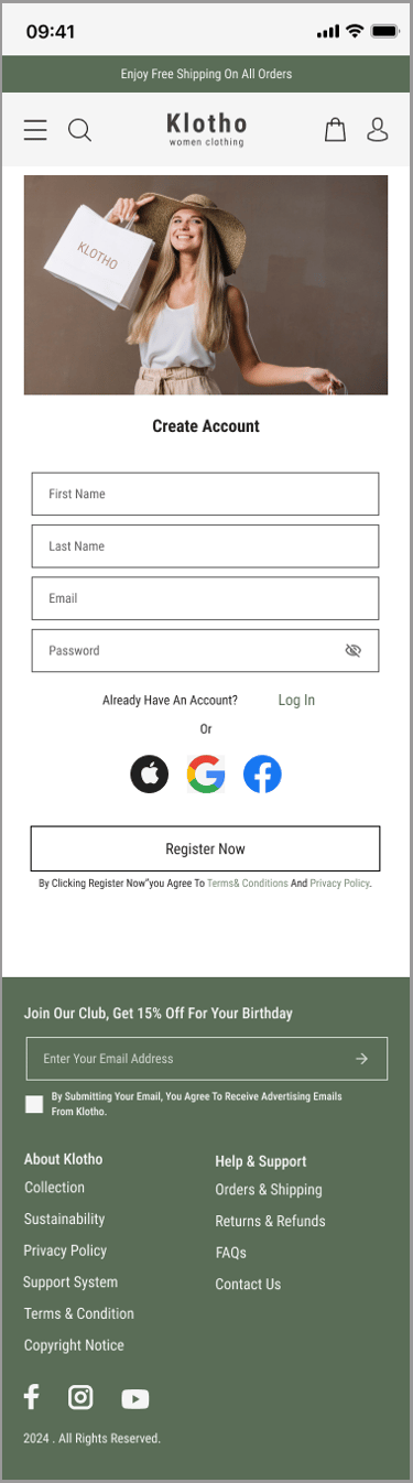
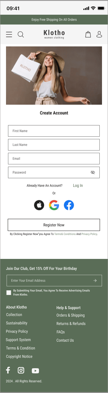
Register Page
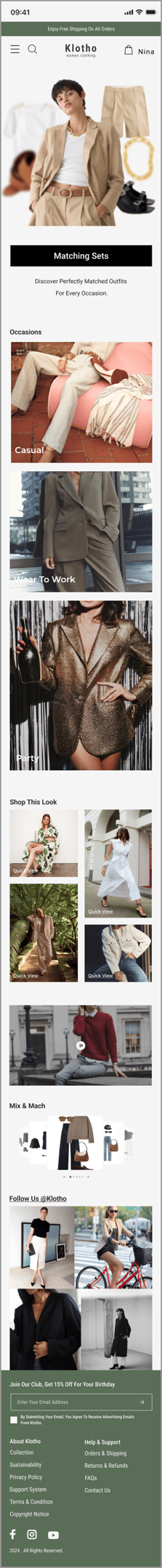
Home Page
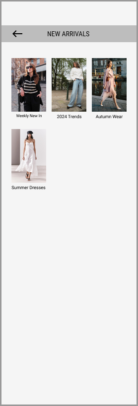
Dresses Page
Dresses Page
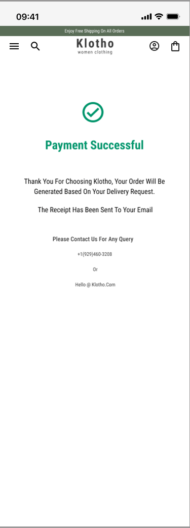
Purchased Page
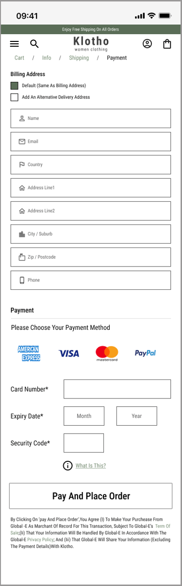
Checkout
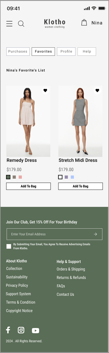
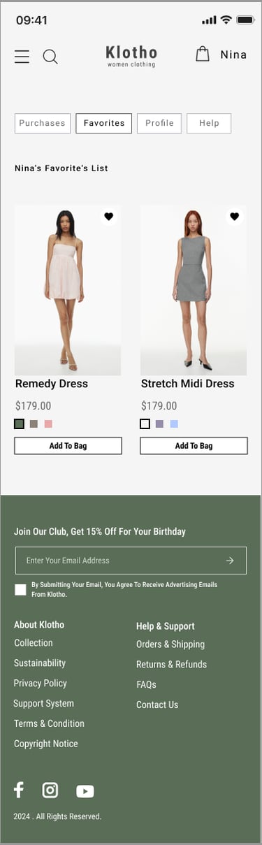
Favorite Page
Choose Size
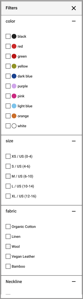
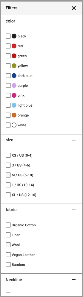
Filters

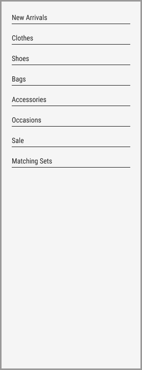

Hamburger Menu
Iteration and Usability Test
Throughout the project, we went through multiple iterations, driven by the insights we gained from usability tests. These tests were instrumental in shaping our decisions and constantly enhancing our project.
2
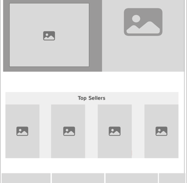
We developed four different concepts for our homepage. After testing and refining them, we selected versions 3 and 4 for the initial phase.
Users particularly favoured design 4, appreciating its dedicated section for showcasing new occasions. This layout simplifies the shopping experience, making it easier for people to find and purchase items.


Version 1

Version 2
Version 3
Version 4
1
Homepage Concept Development and Selection Process
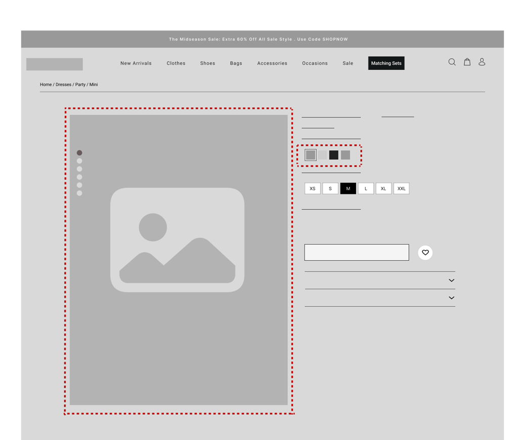
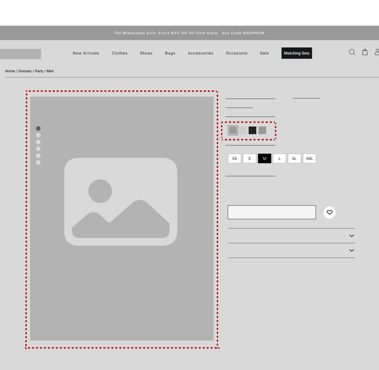
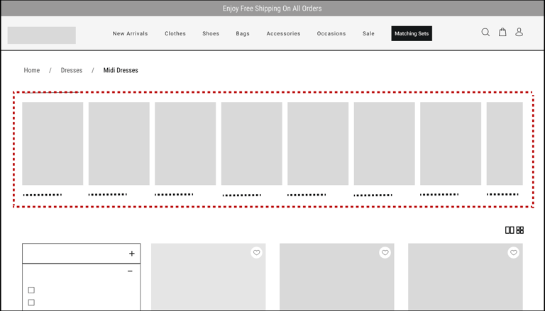
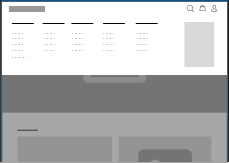
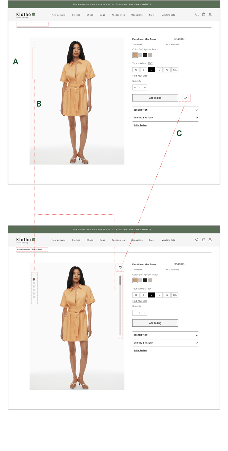
Knowing their location on the website was important to users during usability tests, so we added Breadcrumb navigation at the top of the pages to enhance clarity and reduce confusion.
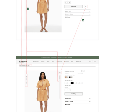
Users initially missed that there were more pictures available for scrolling. To address this, we added a scrollbar and scroll indicators to make it clear that they can scroll down to view additional images.
A
B
Users mentioned that having the favorite heart icon directly on the picture feels more accessible and familiar to them.
C
Enhancing User Navigation and Interaction

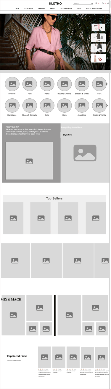
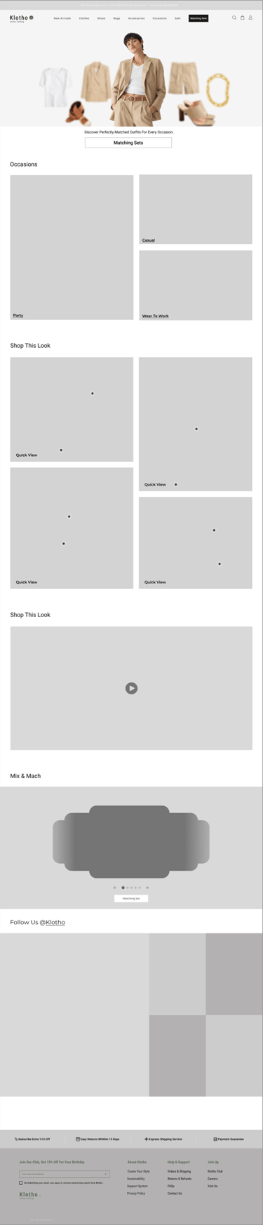

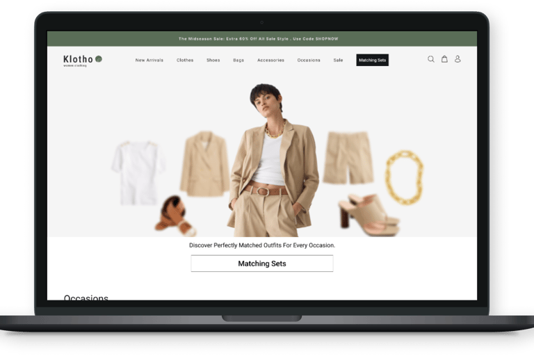
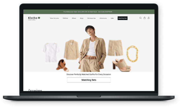
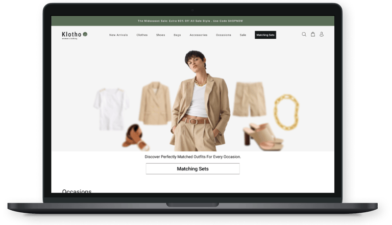
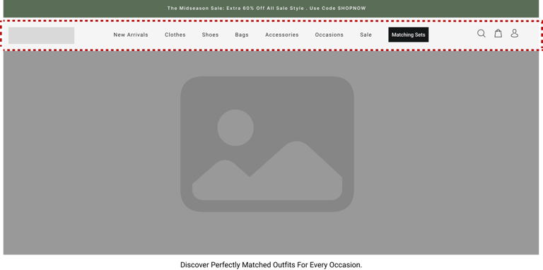
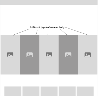
Our goal was to find a hero image that instantly conveys our core message: a curated selection of outfits that seamlessly blend formal and casual styles, making it easy for users to find the perfect look for any occasion.
3
Finding a Hero Image That Conveys Seamless Formal and Casual Style Integration